


We developed an internal design structure that incorporated all design elements. For example, a background pattern was synchronized with the brand mascot and tied all package colours together.
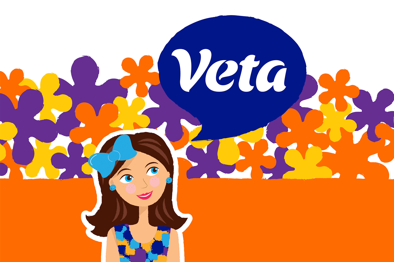
In order to emphasize the interplay of different visual elements, we adjusted the logo block to make it look like a speech bubble from graphic novels.
Customers often choose paper products based on personal trust in the brand. To attract their attention to new positions we added the sub-name Comfy and made all illustrations look hand-drawn. This individual approach showed the manufacturer’s attitude to the comfort of its audience.
A modern and bright design solution with a brand mascot on the package made the products stand out on the shelf full of conservative and even a bit boring-looking products.