Lebenbach
Brief
The client was putting a new brand of Austrian beer on the shelves. The client had to develop a name and package design that would tell the consumer about the product.
Decision
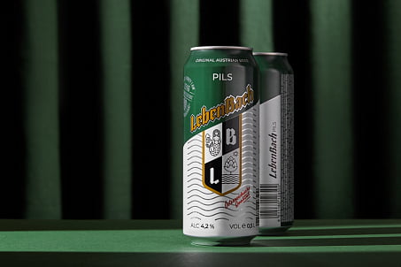
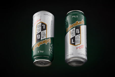
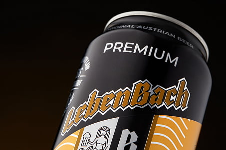
Lebenbach is a harmonious combination of German words. In Russian the name sounds like "river of life", so in the design of the package there is a clear theme of water and flow.
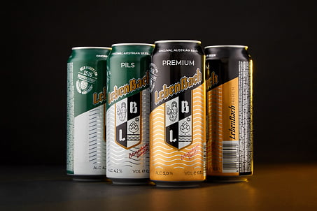
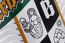
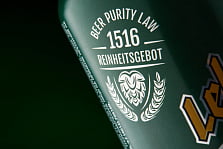
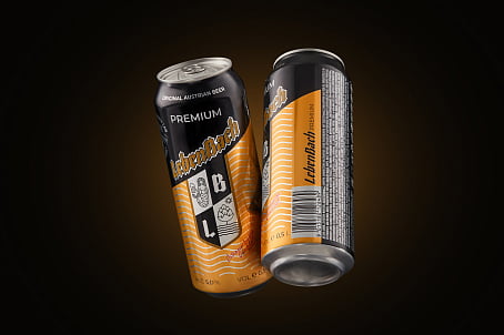
In the center of the composition there is a heraldic sign, telling about the long-term Austrian beer recipe.
The hops depicted on it translate the naturalness of the product, and the mermaid's buff image - the cheerful character of Austrian beer traditions.
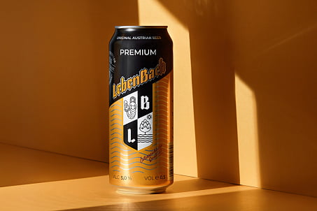
A pattern with a graphic interpretation of the waves complements the "river" idea of TM, and the classic color combinations help to find the right kind of beer on the shelf. For the creation of the logo, a traditional gothic font for the category was used.
