А-100

Brief
AZS "A-100" is a large-scale network of multifunctional gas stations with emphasis on high-quality service and attentive approach to each client. To increase brand awareness and distinguish from the competition, a brand book controlling corporate style was introduced.

Decision
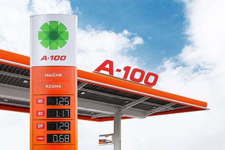
Fabula Branding in collaboration with "Nikoengineering" company worked on the brand book creation, conducted an audit of the visual appearance of the entire network and studied the perception of the target audience. A unified system of visual attributes was developed resulting in an elimination of the existing “disagreements” in the design, where previously those elements blurred the image of the brand and worsened its memorability.
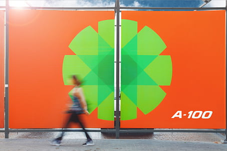
So, the logo was unified, where previously the logo was used both as a form of the typical gerbera flower and as a new "geometric" portrayal. After eliminating various conflicting features, the graphic elements acquired specificand recognizable form.
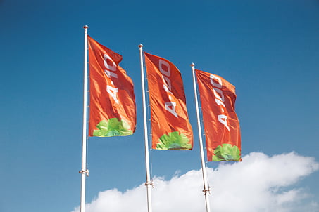
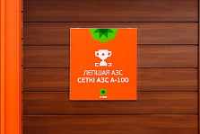
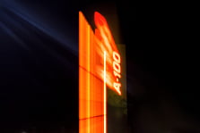
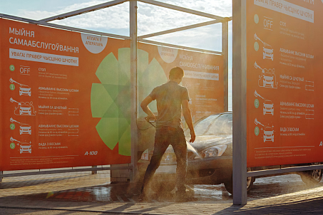
A single color scheme was developed. The friendly orange came to life as a dominant color in the overall design of gas stations, branded company merchandise and communication messages. A warm bright color clearly conveys the values and philosophy of the brand: customer-oriented, attentive, friendly and energetic. A calm gray color helps to highlight the tech aspect of the company.

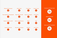

Fixing a particular brand color scheme created a strong association (orange is “A-100") and simplified its identification and memorability.
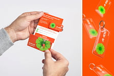
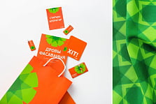
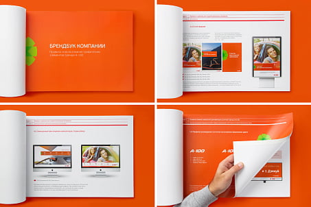
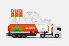
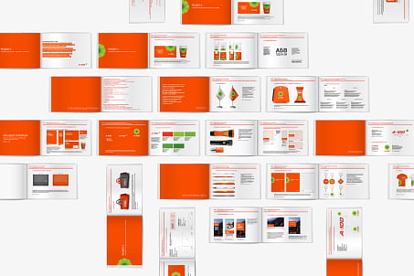
The multi-page brand book describes in detail the implementation features for all identity elements and regulates all it uses: from the standards in the design of souvenirs and promotional materials to the rules for branding spaces, corporate vehicles and corporate website. In total, over two hundred positions were worked on.
