Firmova
The service helps local businesses automate routine processes and efficiently interact with customers while preserving each brand’s individuality.
Brief
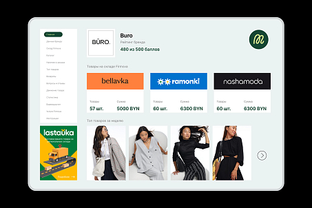
The client was launching a modern e-commerce service for the partner brands Nashamoda, Ramonki, Bellavka, and Lastauka. It is a unified digital ecosystem that brings together online stores of local brands and a logistics platform, allowing users to conveniently analyze data, manage inventory, and track sales.


Objectives
- Develop a name that reflects both the technological nature and local identity of the brand.
- Create an identity suitable for a B2B audience, emphasizing the service’s reliability and systematic approach.
- Develop a universal system of visual assets ready for scaling and digital use.
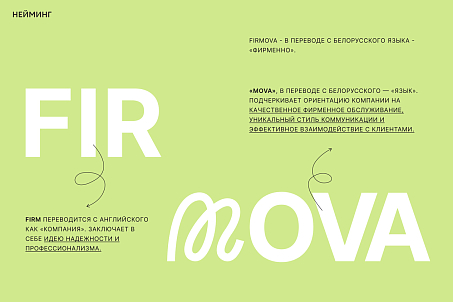

The name Firmova — an adverb that exists in the Belarusian language — became the intersection of two meanings: business and local identity.
Naming
The word firm conveys stability, reliability, status, and confidence. Mova (meaning “language” in Belarusian) adds softness and supports local values, emphasizing the brand’s origin. Thus, the name combines the technological precision of an international format with the mentality of Belarus. Phonetically, the name is resonant, dynamic, and concise — perfectly suited for the digital environment, easy to read, and memorable.

Identity
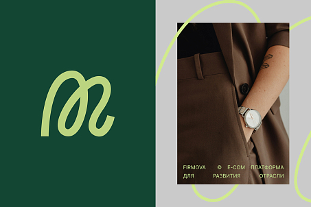
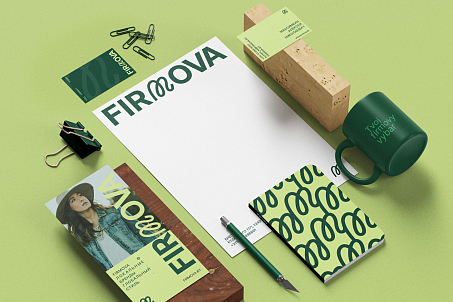
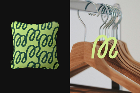
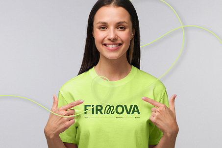
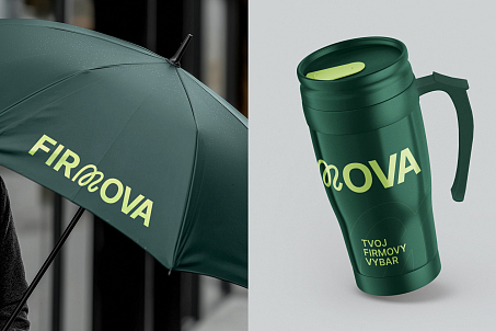
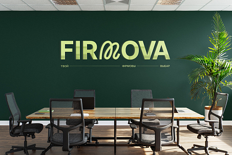
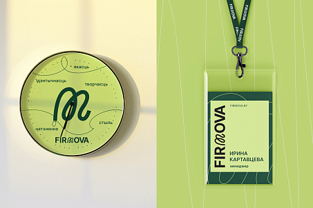
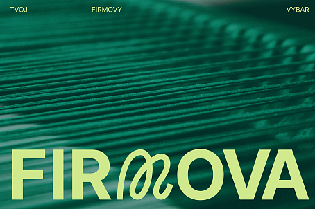
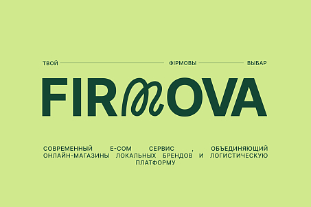
The Firmova identity is built on principles of clarity, structure, and technological sophistication. The key element of the logo is a stylized letter M, an allusion to a thread connecting brands, processes, and users into a single ecosystem. This visual metaphor embodies the main idea of the service — connection. It also resonates with the fashion industry, as clothing and accessories are the core products of Firmova’s clients. The color palette combines a deep green with a subtle lime shade. This pairing emphasizes professionalism and reliability while adding freshness and relevance.

A geometric sans-serif font gives the logo confidence and a technological feel, while typographic play with spacing makes the visual style modern and dynamic.
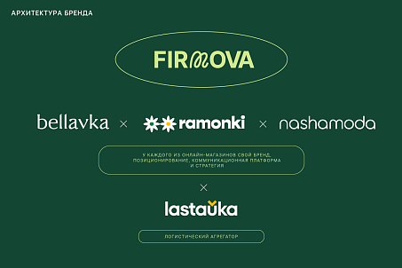
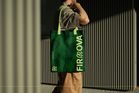
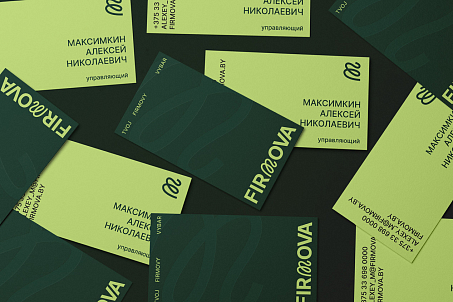
Fabula Branding developed a complete system of visual communication — including brand assets, promotional materials, and printed collateral. The identity is versatile and flexible, easily adapting to any communication channel.

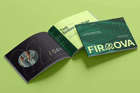

Firmova gained a strong, cohesive, and contemporary image that reflects its values and strategic goals.
Result
Thanks to thoughtful branding and a distinctive name, Firmova became a brand that symbolizes reliable partnership, growth, and support for local business.
