Hi:Health
The task of the agency was to show the advantages of modern personalized medicine through identity.
Brief
The product represents a new generation of medicine. It is a comprehensive diagnostics system including portable gadgets, a mobile app that collects and analyzes information, and a global database.
The system monitors the state of one’s health, evaluates the chances of development of different diseases, and connects the user to respective medical specialists.


Decision
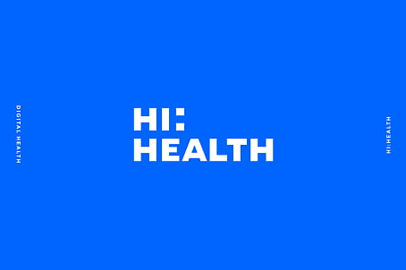
The name Hi:Health is phonetically balanced and illustrates the nature of the brand – its technological edge and individual approach to consumers. The first part – “Hi” sounds like “high” and at the same time is turned into a greeting in brand identity.
The text part of the logo is also a graphic symbol with several messages hidden in its elements. The counter-form is shaped like a cross, and the colon symbolizes a dialog between a user and the app, a patient and a doctor.

The visual solution combines the technological nature processes and personalized approach to each user.
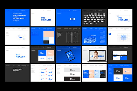
To show it, we’ve selected a colour scheme that creates the emotional atmosphere: the technological white and blue combination is balanced by the warm peach colour of the background.
The style is emphasized by additional elements: large and readable typography (straight lines, right angles, sans-serif), laconic infographics, and photo style (portrait photos at a given angle).

A detailed guideline with the rules of element combination has been developed to simplify further corporate style adaptation. Our team also created a presentation for the project’s ICO.


