Parada
Piaffe Equestrian Club was preparing to relocate. Its new home was a spacious natural area in the village of Dulichi, near the Ptich River. The location offered far more opportunities than a traditional equestrian club could accommodate.
Alongside equestrian facilities, they envisioned a hotel, an apple tree avenue, a park, and various leisure experiences. The site's potential was clear, but the challenge was to bring these different possibilities together into one cohesive concept.
The relocation also created a need to redefine the brand's scope.
- Research the market, target audiences, competitive landscape, and existing brand.
- Assess the potential of the new location and develop brand positioning.
- Create a name that reflects the project's scale and character.
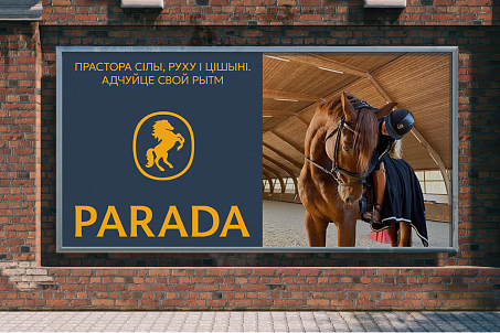
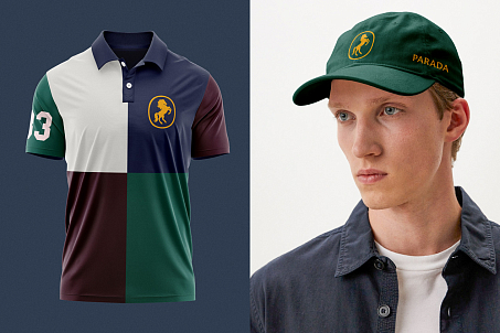
- Develop a visual identity that brings together equestrian heritage, the natural environment, and the brand's premium positioning.
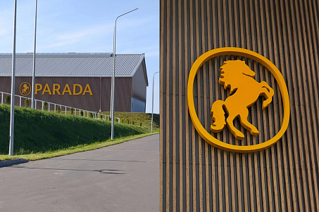
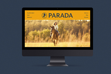
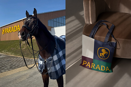
- Demonstrate how the visual system works across key brand touchpoints.

Fabula Branding began by researching the market, target audiences, competitors, and the existing Piaffe brand. At this stage, the challenge was not simply to determine what the club should look like after relocating, but to understand the role the new destination could play for different groups of visitors.
The research revealed a key insight: the owners' ideas — equestrian sports, leisure, nature, accommodation, and additional activities — were not competing directions. On the contrary, they could be united under a single concept.
Fabula Branding proposed moving beyond the traditional perception of the project as an equestrian club and repositioning it as a park with several interconnected areas, with equestrian sports remaining its conceptual and functional core.
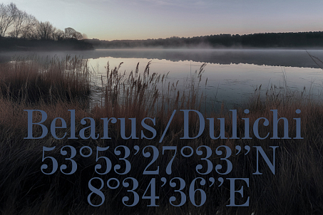
Each cluster serves a distinct purpose and offers its own visitor experience while remaining part of a unified brand ecosystem. This approach allows the project to evolve gradually, introducing new areas and activities without compromising its overall coherence.
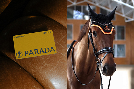
For professional riders, the priorities remain high-quality equestrian facilities, experienced trainers, well-equipped infrastructure, and comfortable amenities. For visitors who are not professionally involved in equestrian sports, the destination offers other experiences — walking, family recreation, spending time outdoors, special offers, and additional activities.
Horses, nature, and a thoughtfully designed leisure culture become the elements that unite the entire experience.
In Belarusian, parada means "advice" or "recommendation." The name captures a simple human truth: when people discover a great place, they recommend it to others, share the experience, and want to return.
Parada also carries an additional emotional dimension. The name evokes parad ("parade"), suggesting ceremonial processions and celebrations in which horses have historically played an important role. At the same time, its sound contains rada, creating a phonetic connection with the Belarusian word radasts ("joy"). This is not a literal etymological relationship but an association that adds warmth to the name and reinforces the brand's character.
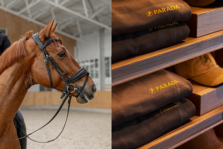
It has a distinctive appearance in Latin lettering while avoiding any direct reference to equestrian sports, hospitality, or another specific function. As a result, the name has enough character to stand independently as a strong brand and enough flexibility to support a project designed to grow in multiple directions.
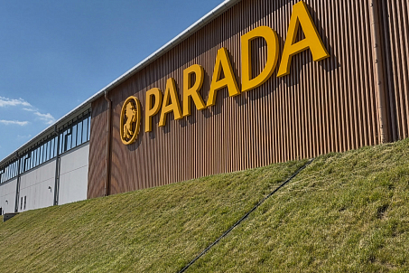
Fabula Branding developed the visual system at the intersection of classical equestrian aesthetics and contemporary sports branding. Traditional sports brands, with their characteristic discipline, simplicity, and sense of heritage, served as an important source of inspiration.
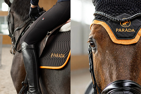
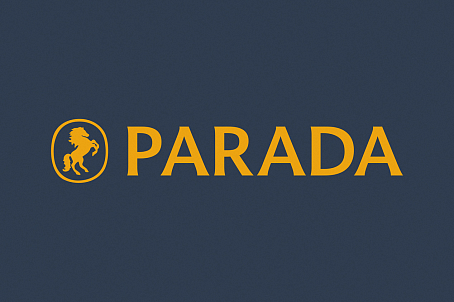
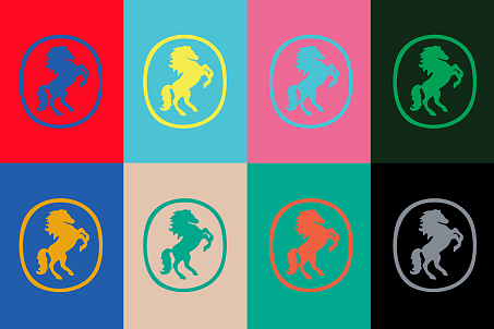
Fabula Branding reinterpreted the visual language of heraldry, giving a traditional symbol a cleaner, more contemporary expression.
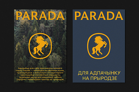
The emblem's composition references a signature seal and a family crest. This conveys a sense of continuity, exclusivity, and belonging to equestrian culture without making the visual identity feel like a historical imitation.
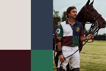
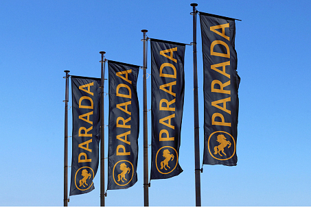
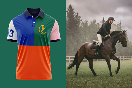
The color palette follows the same logic. Royal blue establishes a sense of credibility, sophistication, and premium quality, while vibrant yellow introduces energy and contemporary contrast. Together, they give the brand a prestigious yet refreshingly modern appearance.
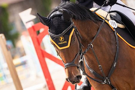
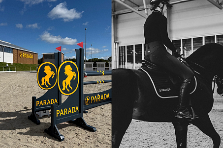
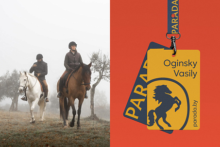
This allowed the client to see not just individual design elements, but a cohesive visual system and how the brand could come to life in a physical environment.

The project received a new name, positioning, and visual identity — Parada. Fabula Branding brought the owners' diverse ideas together into a unified development model and created a brand that extends beyond the project's current function.
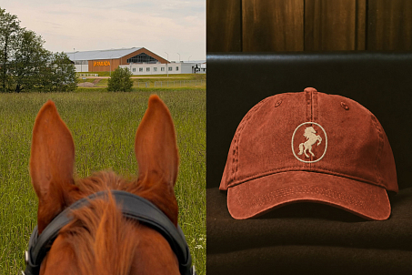
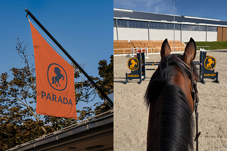
Ultimately, the relocation became a turning point for the project: a traditional equestrian club evolved into a brand with a broader vision, a new identity, and a system designed to support its continued growth.