Pramova

Brief
"Collegium" is a group of companies united by the mission of protection and safety of business. This is a team of ambitious professionals, who approach the work comprehensively, offering clients a full range of services: legal, accounting, auditing.

The desire to meet the new challenges of the local and international markets has led the "Collegium" to the need to change.
Decision
Not only the image in the eyes of the client had to be changed, but also the principles of interaction within the team, as well as positioning and development strategy. The Fabula Branding agency rose to this challenge.

Together, the agency and client teams transformed Collegium into Pramova, a group of companies providing a full range of legal and accounting business support services.
The transformation began with an analysis of the market, competitors and audience, as well as an internal audit. This stage helped to identify the company's growth points: conveying the importance of services, increasing productivity, creating a comfortable environment for cooperation with clients.

As a result, a platform and brand positioning were created, based on a thorough immersion in the task, efficiency and focus on results. This created a capacious, modern, energetic image that encapsulates the idea of deepening and development in a simple and bright form.

An important step towards a global change in the image of the group of companies was the creation of the new name Pramova.
This harmonious Belarusian word conveys the idea of openness and expertise in communications with people.
The name eloquently speaks about professionalism and national orientation of the brand, because, besides the meaning of "speaking to the public", it has another meaning — a single language source for the whole language family. A parallel can be drawn that our group of companies also has common goals and values.

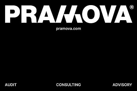
The stylized letter M in the logo conveys stability and confidence. The graphic element consists of 4 solid parts that support each other to form a stable structure. It is a symbol of the 4 Pramova companies and their effective interaction. The corporate colors — yellow and black — are an active, memorable combination, which emphasizes the ambitiousness of the project and desire for development.

Together with the client the agency worked out company's development strategy. This document provides for a single audience and principles of mutual support within the team.


