Shagovita
Brief
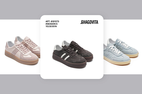
Shagovita is a well-known brand that had long been associated primarily with children’s footwear. By the time the project began, the brand had reached an important stage in its development: the rebranding needed to reflect internal changes, business modernization, and the brand’s expansion into a broader category. Shagovita had grown from a children’s footwear brand into a footwear brand for adults and teenagers as well.
The company has been operating on the market since 2010, and the update became part of a larger development strategy.
The previous visual system was built around the letter “S” in a circle and its combination with the wordmark.
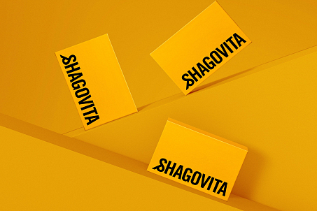
The new identity had to communicate the brand’s momentum, relevance, and forward movement more precisely.
For Fabula Branding, the project was not only about a visual refresh, but also about carefully recalibrating brand perception at the level of positioning, architecture, and communication.
Objectives
- conduct brand analysis and audit;
- define the updated positioning;
- build a brand architecture for different audiences;
- develop a visual identity;
- shape the brand’s verbal communication.
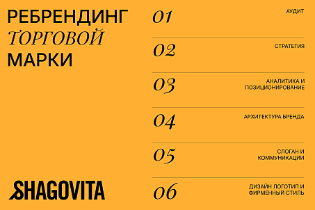
Brand Analysis and Audit
At the analytics stage, Fabula Branding identified a gap between the current perception of the brand and its actual product range.
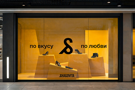
The main barrier was brand perception: strong associations with children’s footwear made the bright and relevant women’s line less visible to the audience.
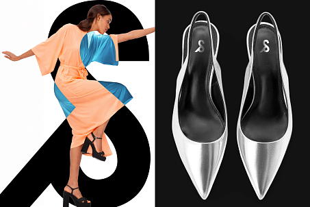
At the same time, the children’s category could not simply be abandoned — relevant children’s products genuinely helped increase purchase frequency.
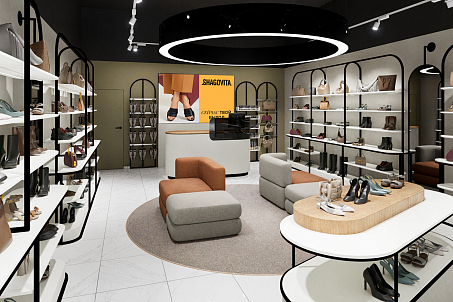
The research also showed the high importance of the offline experience. For customers, the store atmosphere, visual merchandising, promotions, and completeness of the assortment all matter.
People expect not just a functional purchase, but aesthetics, emotions, and additional accessories at the point of sale.
Positioning and Architecture
The key task was to separate product lines for different audiences without losing the brand’s overall integrity. Fabula Branding strengthened Shagovita’s status as a lifestyle brand of footwear and accessories, while also building a clear architecture in which different offers are perceived more accurately and do not compete with one another within a single brand.

The agency developed the brand positioning: “Stylish. Free. Sincere. About you.”
This formula moves Shagovita from the field of a functional offer into the space of lifestyle.
The brand speaks not only about footwear, but also about a state of mind — confidence, freedom of self-expression, naturalness, and attention to the individual.
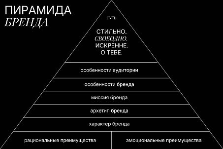
This approach made it possible to combine the audience’s rational expectations with an emotional level of perception.
Shagovita remains a brand about comfort and quality, but begins to sound more trend-driven and to speak the same language as its customers — as a brand that accompanies a person in everyday life.
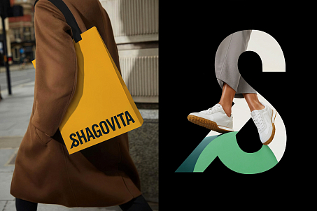
Visual Identity
When developing the design system, Fabula Branding studied contemporary trends as well as the visual codes of premium footwear and clothing brands. This made it possible to create a distinctive identity that helped convey Shagovita’s dynamism, ambition, and relevance.
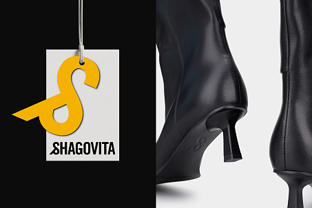
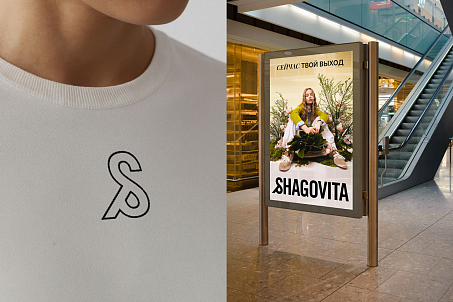
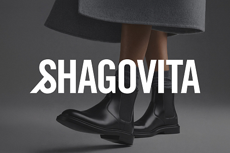
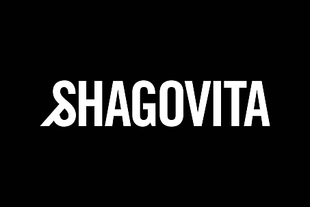
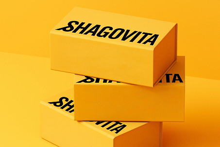
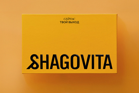
The new logo is based on a typographic and graphic composition with a stylized ampersand.
Fabula Branding embedded two layers of meaning into this symbol. The first is movement: the ampersand appears to be taking a step, supporting the brand name. The second is connection: the symbol itself represents a link, and in the context of the brand, it unites different audiences in a shared desire to look great and feel confident.
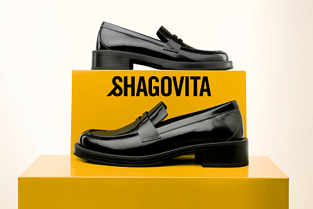
This solution helps the brand remain noticeable while looking more composed, relevant, and confident.
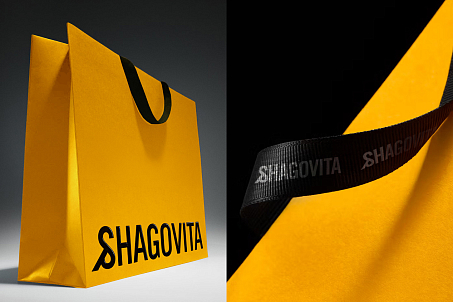
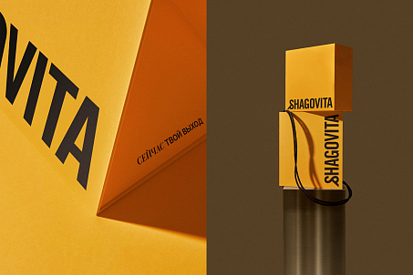
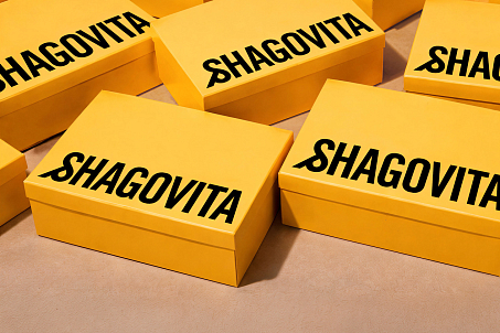
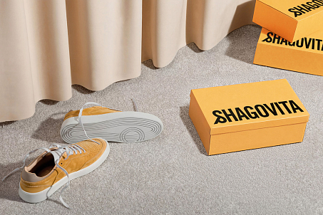
The brand palette is built around an accent yellow combined with restrained shades of chocolate, black, white, and green.
Verbal Communication
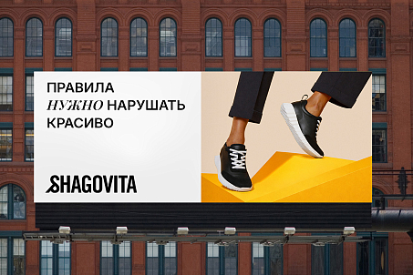
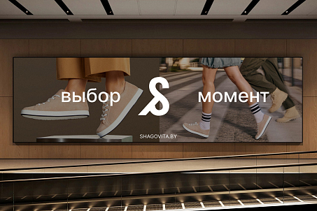
The slogan “Now It’s Your Moment” became a concentrated expression of Shagovita’s new character: bold, contemporary, and emotional, while still directly connected to the footwear category, the idea of taking a step, and personal choice.
Together with the positioning, the slogan shapes a brand communication style that addresses the person as the main character.
Shagovita is no longer limited to the role of a familiar footwear manufacturer — the brand begins to speak the language of confidence, freedom, and personal style.
Dmitry Kashkan, Managing Partner at Fabula Branding
“For Fabula Branding, this project was about precisely adapting the brand to a new scale. Shagovita had already outgrown the perception of being an exclusively children’s brand, and the task was to preserve the trust it had built while opening the brand up to a new audience. As a result, a more modern and confident image emerged — one that reflects the brand’s contemporary style, relevant visual system, and clear emotional communication.”
Ekaterina Astapenko, Director of Shagovita Trading House CJSC
“For Shagovita, the rebranding became a logical continuation of the company’s internal changes. It was important for the brand to show that today it is developing beyond its previous perception and offers footwear for different audiences, while maintaining strong expertise in product quality and comfort. The updated positioning and visual identity accurately reflect what Shagovita is today and create a foundation for further growth.”
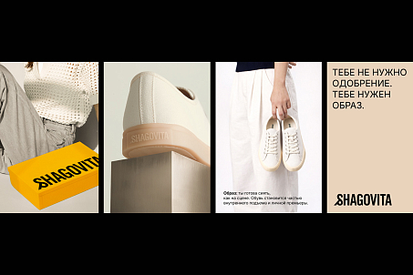
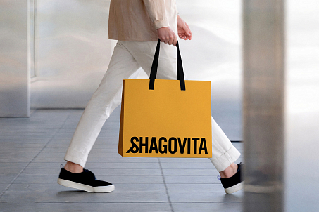
The Shagovita rebranding became the visible part of deeper transformations within the company.
Result
The update marked the brand’s transition into a new category of perception: from a strong association with children’s footwear to a contemporary lifestyle brand with a broader architecture and an up-to-date system of visual and verbal communication.
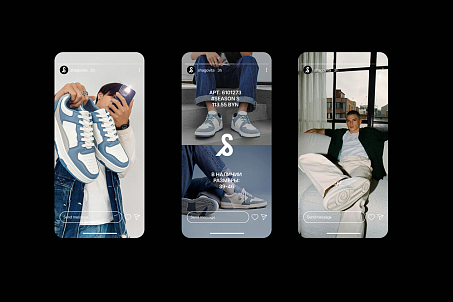
Thanks to the new visual identity, the brand has become more noticeable, vibrant, and confident.
The positioning helped build a clearer emotional image, while the architecture separated offers for different audiences without undermining the brand’s integrity.
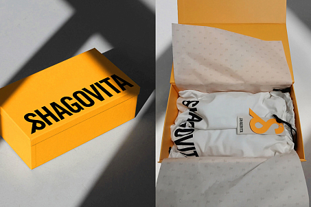
As a result, Shagovita received a branding system that works not only for recognition, but also for long-term development.
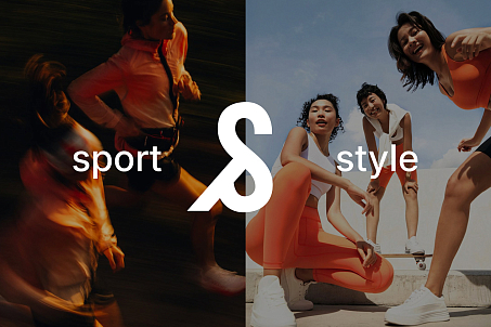
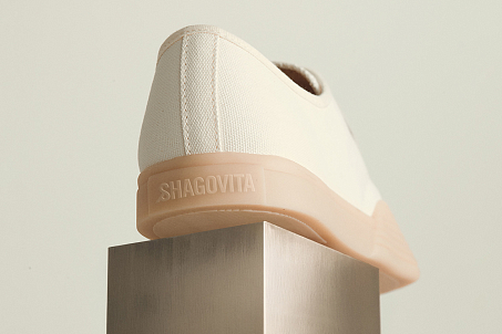
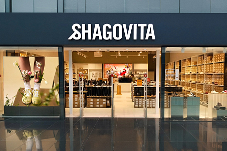
The updated style and logo have already appeared on the company’s official website and social media, in store design, packaging, promotional materials, and other brand touchpoints.
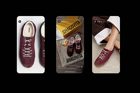
The rebranding itself has become an important step in strengthening Shagovita’s position on the market and rethinking its role for the customer.