Bioteca Gourmet

Brief
Bioteca oils by Azamet Pro are a unique product. They are manufactured using the direct compression method that helps preserve vitamins and microelements in an easily digestible form.


The Classic product range of this TM was successfully launched in the Moldovan market, and the customer decided to begin exporting it.
However, before export the label design had to be updated, and a clear visual image of the product needed to be created. The solution also had to be adapted for the new Gourmet collection by Bioteca - a сustomized collection of oil mixes.

Fabula Branding had to emphasize the artisanal nature and purity of the product.
Decision
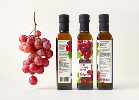
Therefore, the team decided to develop a large logo with handwriting-like lettering. The new logo zone indicates the naturalness of the product. The peculiarities of oil compositions were taken into consideration in product range design. For example, Classic products are based on one natural component, and the advantage of Gourmet positions lies in the variety of flavors and components as each mix has its own unique composition. The photo zone was developed in view of these factors. It is based on large and tasty-looking photo style illustrating the naturalness of the oils. The team of Fabula Branding also developed key visuals communication the nature of the products in both ranges.
Valentina Uzun, the founder of Bioteca:
«The updated trademark had already been launched in Moldovan retail networks, and the sales volumes considerably increased after the redesign. Bioteca is also available in Japan as a national Moldovan product. We plan to launch our products in the markets of Russia, Belarus, Ukraine, Romania, China, and Baltic states».


