Boomy
Brief
Boomy is a new diaper brand developed using Japanese technologies. At the heart of the product are a child’s comfort, parents’ peace of mind, and reliable everyday protection.
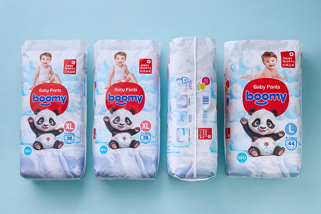
The brand offers diapers designed with carefully selected materials, an anatomical fit, breathable hypoallergenic layers, and easy-to-read weight-based sizing.
Together, these features make everyday care simpler, safer, and more convenient for the whole family. Fabula Branding was tasked with developing a logo, visual identity, and packaging design for a new brand that needed to look modern, caring, and stand out on the shelf.
Objectives
● to show the brand’s connection with Japanese technologies and a culture of careful attention to detail;
● to create a soft, emotional, and friendly image that is clear to parents and appealing to children;
● to help the brand stand out in the diaper category through bright, recognizable packaging;
● to develop a logo and visual system that can be easily scaled across different formats and product lines;
● to convey a sense of comfort, lightness, safety, and care.
The logo feels friendly and easy to read: rather than standing apart from the category, it reinforces its core expectations — tenderness, safety, and care.
Logo
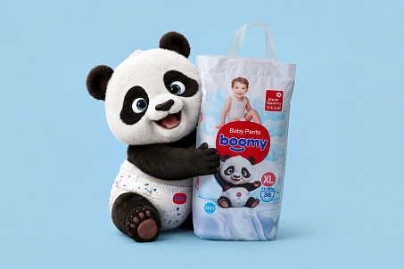
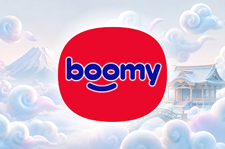
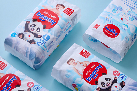
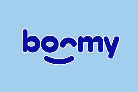
Fabula Branding built the Boomy logo around rounded, “inflated” letterforms. This plasticity immediately connects the brand with softness, airiness, and comfort. The two “o” letters play a special role: they turn into expressive smiling eyes, giving the mark an emotional character. Boomy begins to feel like a small, friendly character that accompanies the child in everyday life. One of the logo placement options is a rounded red label. This technique strengthens brand recognition and delicately supports the association with the Japanese origin of the technologies. The red accent works as a strong navigation point on the packaging and helps make the brand more memorable.
Identity
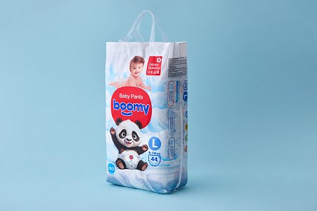
Boomy’s identity is built around a combination of blue, white, and accent red. White stands for cleanliness, safety, and hygiene. Blue adds a sense of freshness, reliability, and calm. Red becomes an energetic accent that makes the packaging more visible. An additional layer of the visual identity is created by ornamental cloud elements. Their flowing lines support the feeling of softness, airiness, and delicate touch — the very qualities that are essential for diapers.
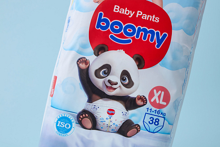
Fabula Branding used background illustrations inspired by the style of Japanese ukiyo-e prints.
This approach adds cultural depth to the visual system and supports the connection with the Japanese technologies at the core of the product. The graphic elements do not overload the design; instead, they create an atmospheric background — neat, decorative, recognizable, and at the same time modern. For Fabula Branding, it was important to find a balance between the rational and the emotional. On the one hand, the packaging needed to communicate reliability, production control, and clear product information. On the other hand, the diaper category requires warmth, softness, and a tone of trust. As a result, the visual system turned out to be minimalist and bright, yet friendly.
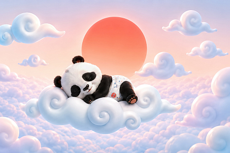
To create an emotional connection with the audience, Fabula Branding introduced a cute baby panda mascot into the identity.
Its rounded silhouette and friendly facial expression support the brand’s character. The baby panda helps build a dialogue with the audience, creates a sense of attachment, and gives parents the image of a caring helper. The panda wearing a diaper becomes a simple and clear visual code: it shows the product in action, adds liveliness to the packaging, and helps communicate the category more quickly. The character is memorable and works easily across different types of communication — from packaging to promotional materials.
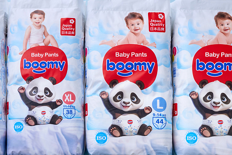
Boomy received an identity that helps the brand communicate care, safety, and peace of mind in everyday childcare.
Result
Fabula Branding created a cohesive diaper brand image for Boomy, combining technology with soft emotional appeal. The logo conveys friendliness and comfort, the color system makes the packaging visible and clean, while the mascot and decorative elements add warmth and memorability to the brand.