Farba Fabrika
Brief
"Kolorit Farb" is a Belarusian manufacturer of paints and coatings, well-known in the market. With an expanding product range and the launch of new items, the company realized the need to strengthen its visual identity and revamp its verbal communication. The goal was to make the product line more recognizable, expressive, and modern.
Fabula Branding searched for a word that would be self-explanatory and feel genuinely “native” to the local market.
Name
The branding journey began with the name — it had to instantly grab attention, evoke emotion, and reflect the product’s origin.
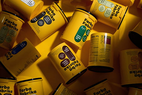
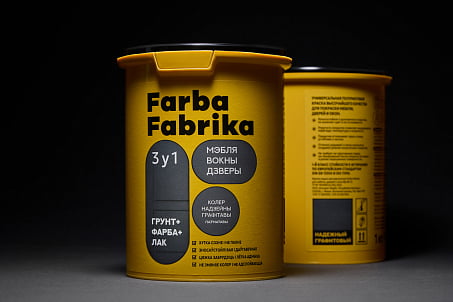
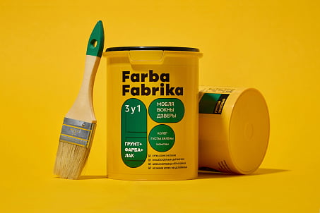
That’s how the name Farba Fabrika was born — a bold, energetic name that immediately conveys both the product and its roots.
It carries a Belarusian euphony, a hint of industrial flavor, and the sense of color as action, as process. It’s a color factory — a place where images and ideas come to life.
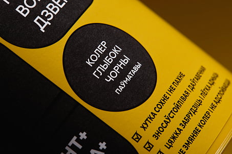
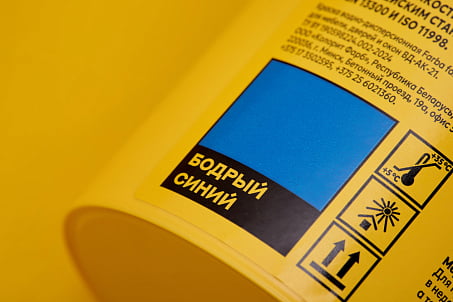
The use of Belarusian shade names right on the packaging turns each can into a small cultural statement — a product that speaks the buyer’s language, reinforcing emotional connection and trust.
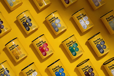
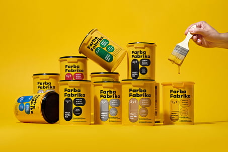
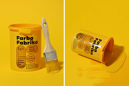
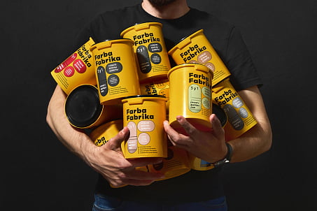
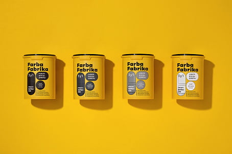
The signature color scheme — a vivid combination of black and yellow — stands out on the shelf and evokes precision, energy, and a sense of high-tech.
Packaging Design
The visual solution is built on the principles of minimalism, clarity, and distinctiveness.
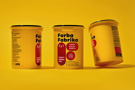
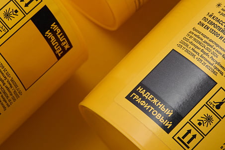
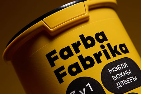
The typographic logo is strict and confident, free of unnecessary decorative elements. The category marker is a neat brushstroke, painted in the actual color of the product. This helps consumers navigate the range quickly and builds trust through visual honesty.
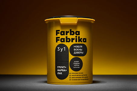
The nationally flavored name added depth and a unique personality. Now, each can is a new stroke in the grand palette of a Belarusian product made with meaning and style.
Result
The redesign enhanced brand perception, making the packaging bold, modern, and emotionally resonant.
