Veta Nova
Veta is a Belarusian brand of hygiene paper products, including paper napkins, paper towels, and toilet paper. Its entire product range is made from 100% cellulose.
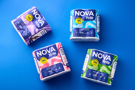
The goal of the new Veta Nova line was to build the image of a modern Belarusian brand capable of confidently competing with international brands on retail shelves.
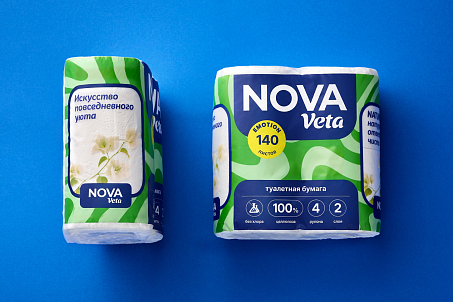
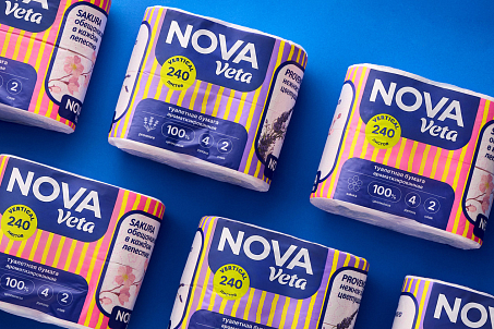
- develop a new packaging design;
- create a consistent and recognizable visual identity for the product line;
- clearly differentiate economy and mid-plus products;
- ensure easy navigation across the range.
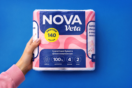
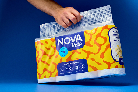
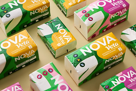
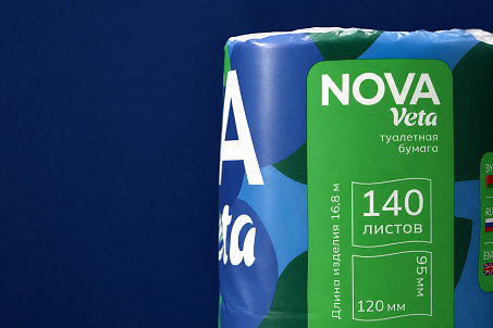
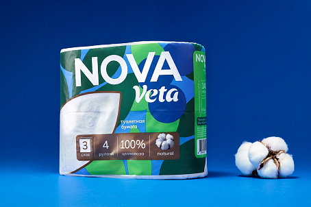
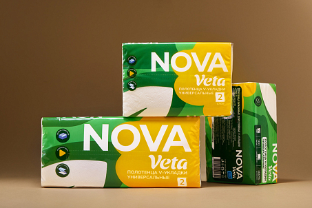
The new design is built around bold, confident typography and a clear packaging structure. Fabula Branding increased the brand’s shelf visibility through vibrant color combinations and prominent typography, while arranging informational and decorative elements to make the packaging easy to read at a glance.
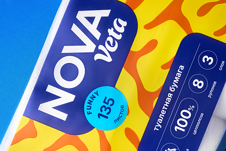
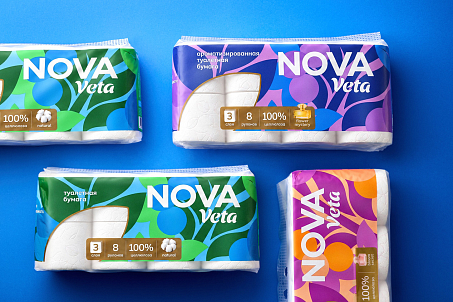
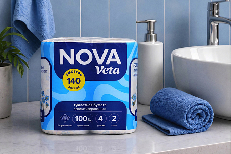
Its simple geometry supports the more practical character of this part of the range while maintaining a clear visual connection to the overall brand system. For the mid-plus segment, a more intricate botanical motif was introduced.
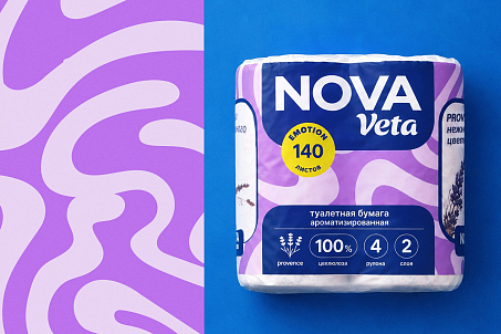
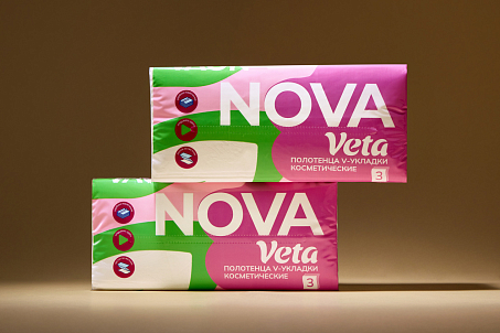
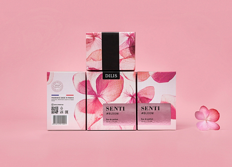
An additional layer of differentiation comes from a dedicated area featuring small product-related images, such as perfume bottles or cotton. This helps distinguish between different fragrances and product features without overloading the overall packaging design.
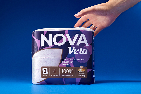
As a result, different visual characters coexist within a single design system: each segment has its own distinctive tone, while the brand remains consistent and recognizable across the entire range.
The brand continues to expand its presence across retail outlets and develop its social media communication, strengthening recognition among Belarusian consumers.