Zvonka

Brief
"Babushkina krynka" launched a yogurt and dessert brand that combines a variety of flavors, health benefits, versatility and convenience.
It is a range of products already known and loved by consumers, now brought together under a new brand. The distinctive feature — different form factors, including quite non-standard, such as: jug, bottle, tetrapak, cup.

Decision
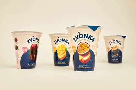
Fabula Branding conducted research of the market, consumers, and trends. As a result, we created the positioning "Always tasty, always healthy". Packaging design further expanded on this idea — the compositional center is a large food zone with appetizing fruits, berries and cereals.


This good-sounding Belarusian word is associated with energy and vigor, and it conveys these qualities to the product.
Zvonka is a bright name uncharacteristic of the category, so it is easy to remember. The logo is an arc-shaped font block of the name, made with unique lettering and supplemented with a status line describing the desserts.


Deep blue and beige, unconventional for a dairy shelf, were chosen as the brand colors, emphasizing the naturalness of the product.
The contrasting combination, visually dividing the package in half, helps create a brand wall on the shelf.


