ALLBERG
Brief
ALLBERG LOGISTICS is an international logistics company operating since 2013 and specializing in comprehensive cargo transportation between Europe and Asia, as well as major routes from America and Africa. The company provides a full cycle of logistics solutions — from standard transportation to complex multimodal schemes.
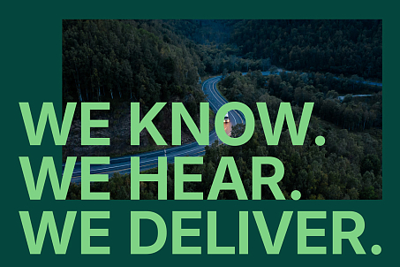
The logistics operator entered a new stage of development and required a brand update that matched the scale of its business and modern market expectations.
Objectives
- to update the logo while preserving continuity and strengthening its semantic connection with the name;
- to create a modern, structured identity for the international B2B market;
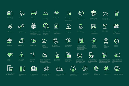
- to develop a scalable system of visual brand assets;
- to create a new website based on UX research and a design system;
- to strengthen the perception of ALLBERG LOGISTICS as a strong, mature, and technologically advanced logistics operator.
Even before working with the agency, the company sought to express the idea of mountains in the logo — as a metaphor for stability, height, and strength.
Identity
This association reflected the meaning of the name ALLBERG LOGISTICS, but required a deeper and more contemporary interpretation.
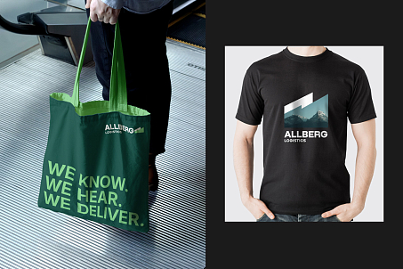
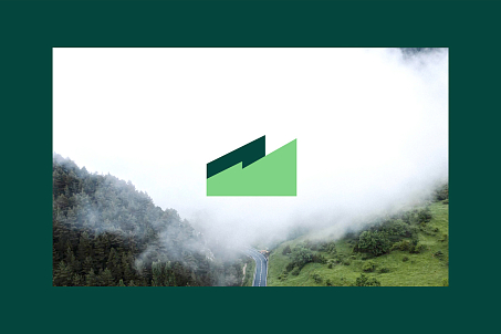
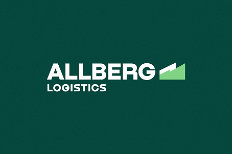
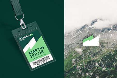
In the new logo, the mountain theme is fully realized. In the form of the graphic element, the mountain silhouette became solid and monolithic, harmoniously complementing the bold grotesque typeface. Aerial perspective and gradient transitions emphasize scale and depth.
The visual image became cleaner, more structured, and more technological. The brand palette is built on calm shades of green that communicate stability and sustainability.
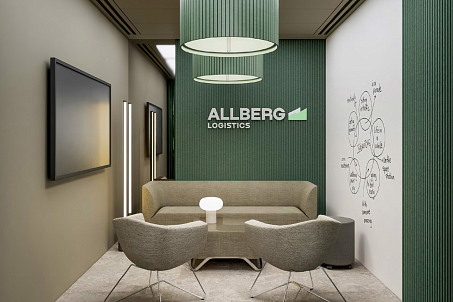
Strict, minimalist typography reflects the systematic and reliable nature of the business. The identity turned out to be universal and modern: it works equally well in digital, print, and navigation, while retaining the professional character of the brand.
Assets
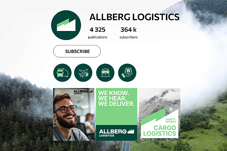
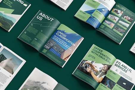
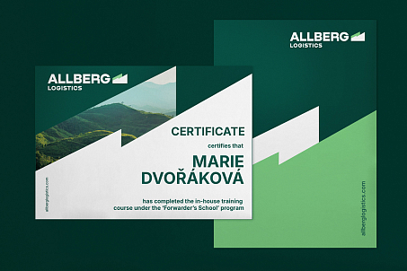
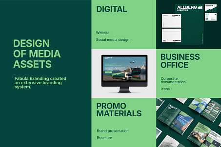
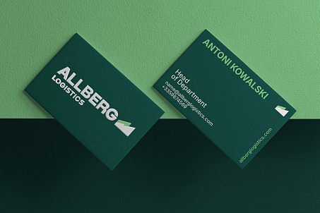
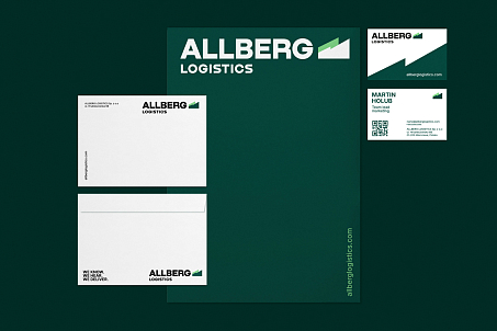
Fabula Branding created a comprehensive branding system. It includes business stationery, branded document templates, presentations for clients and partners, promotional and image materials, social media templates, graphic modules, and elements for further brand scaling.
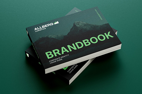
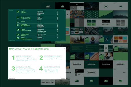
A brand book was created for the client so that the design system remains universal, convenient, and easy to implement in the company’s operational processes.
The agency team studied B2B user interaction scenarios and the needs of managers, logisticians, and business owners.
Website
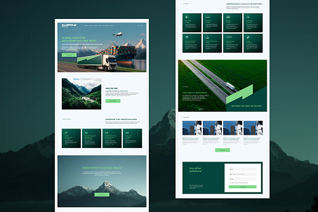
On this basis, a structure was developed that simplifies access to key information: routes, services, solutions, documents.
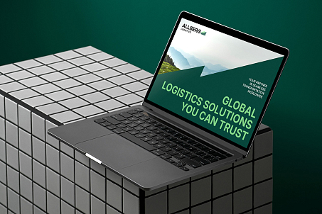
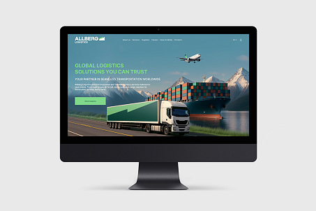
The visual concept combines signature green colors, a clean interface architecture, structural grids, and a photo style reflecting the geography of international routes. Each screen is designed to quickly convey the company’s value, explain services, and demonstrate the team’s expertise. The website is equally convenient on smartphones, tablets, and laptops — a crucial requirement for the logistics market, where decisions are often made on the go.
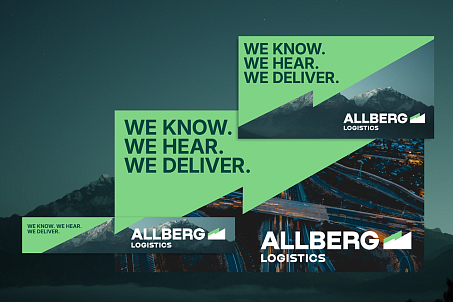
The refreshed brand helps ALLBERG LOGISTICS strengthen partnerships, build trust, and confidently expand its geographic reach.
Result
ALLBERG LOGISTICS received a modern, structured, and confident brand that reflects the strategic nature of the business and strengthens the company’s image in the international market. The new visual identity became a full-fledged communication and sales tool.
