Look Like
Comprehensive trademark development for online store.

Brief
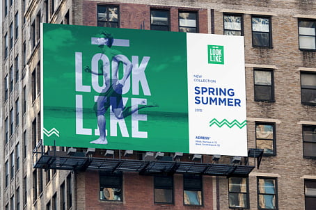
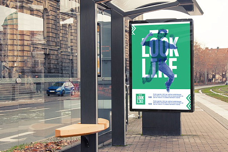
For an online clothing and footwear store was required to develop a brand that would be most effective in the Internet environment: bright, catchy, in a youthful style, with ample opportunities for fans.
Decision
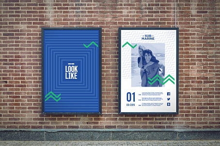
The basis of the name has its origins from English expression that means "look like" (emphasizing the trademark category of the product) and in harmony with the .by domain name, it creates different rhythm and adds visual and semantic richness. Dividing the phrase into two words ("to see" and "like"), we have strengthened the positive communication and added a gaming element.
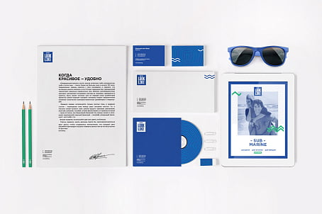
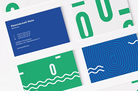
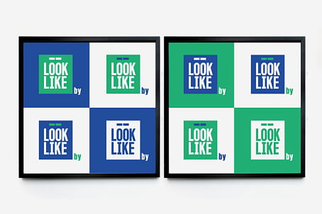
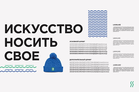
The corporate identity of the brand is based on the active use of proprietary blue-turquoise scale and clear geometric shapes, such as squares, zigzags, waves, lines.


Find out more about the health of your brand

