Motomafia
Brief
Motomafia is a brand of gear and accessories for motorcyclists, aimed at professionals and experienced enthusiasts. The project is built around the ideas of freedom, inner independence, and community support. It is not just a store, but a point of attraction that unites people with a shared philosophy and lifestyle.
At the very start, the brand needed an identity that would reflect its idea, philosophy, aesthetic code, and connection with its target audience.
Task
To create a visual system and verbal communication that:
- conveys the spirit of freedom and independence;
- visualizes dynamism and confidence;
- forms a strong and memorable brand image;
- easily adapts to different carriers: from online platforms to outdoor advertising and merch.
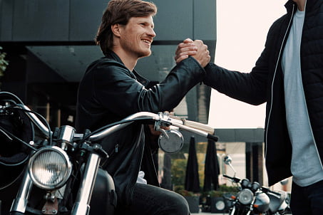
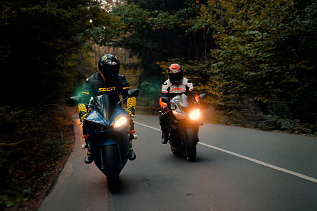
The inspiration came from the image of the modern motorcyclist: independent, bold, part of a community, yet retaining individuality.
Solution
The Fabula Branding team began the work by immersing themselves in the context. Particular attention was paid to the behavioral patterns and visual culture of bikers.
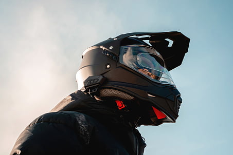
Kiril Vyazmikin, designer
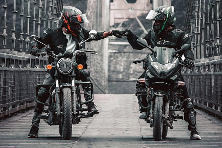
"From the moment I started working on the project, I began observing motorcyclists more closely to understand them from within. I noticed interesting details: they always greet each other, ride together, and are not afraid to be themselves, expressing their individuality through their style. This is the essence of true freedom. I wanted to capture that feeling through the brand’s visual identity."
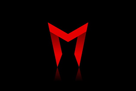
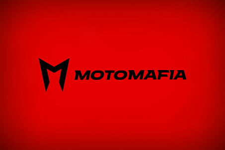
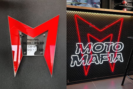
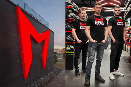
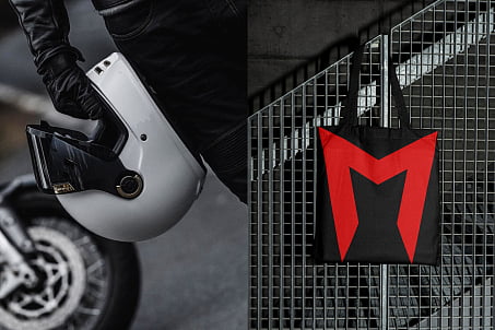
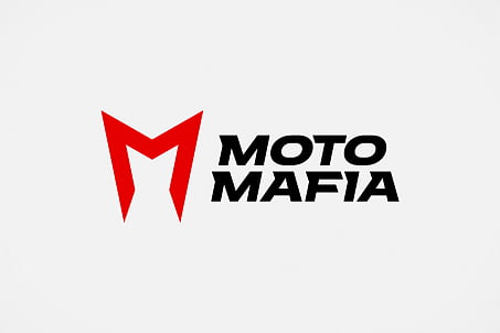
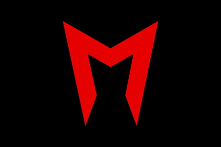
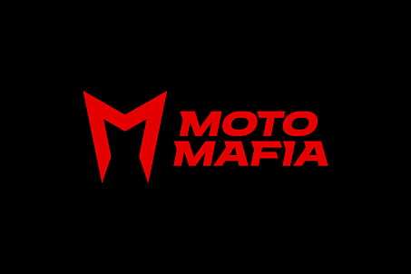
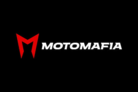
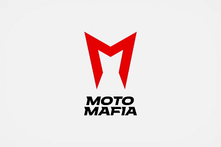
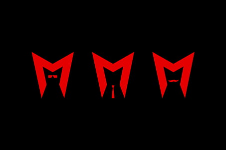
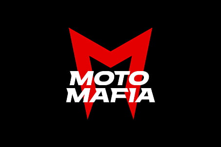
The key element of the identity became a bold and expressive logo. It is a typographic composition with a symbol in the form of a stylized letter "m," which simultaneously references the silhouette of a motorcyclist, a motorcycle helmet, and the brand’s mascot — a cat.
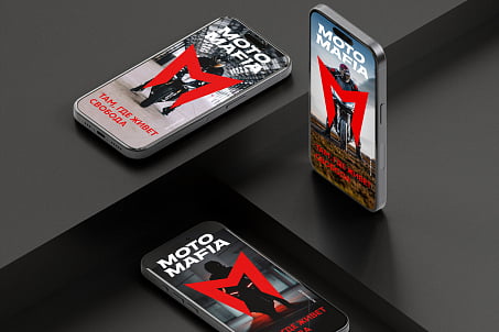
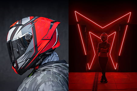
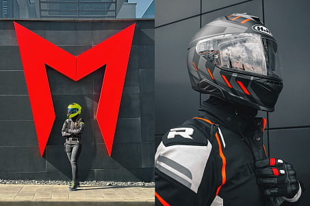
The symbol easily transforms and can be used as an independent graphic element: it becomes the basis for arches, photo zones, prints, and branded merchandise.
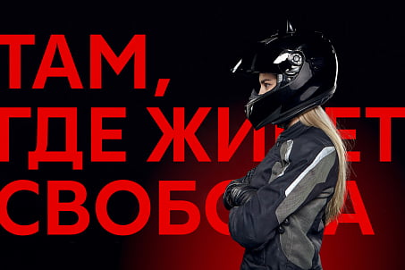
The color palette is based on a striking contrast of red and black — colors traditionally associated with speed, energy, and inner strength. The typography is modern and dynamic, emphasizing the character and confidence of the brand.
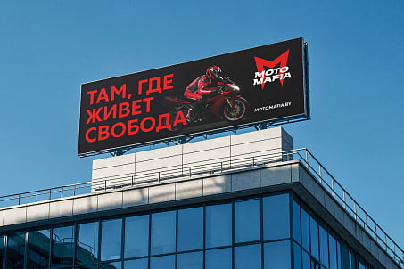
The slogan “Where Freedom Lives” defines not only the tone of communication but also the philosophy of the brand as a whole.
Motomafia is not just about gear — it is a space where everyone feels free. Free to choose their route, to express themselves, to strive for independence.
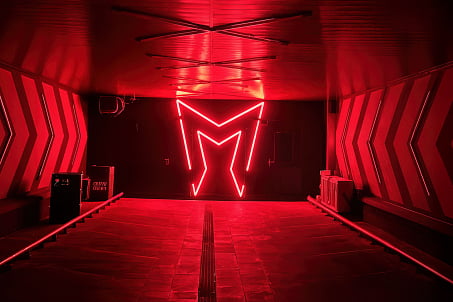
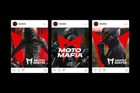
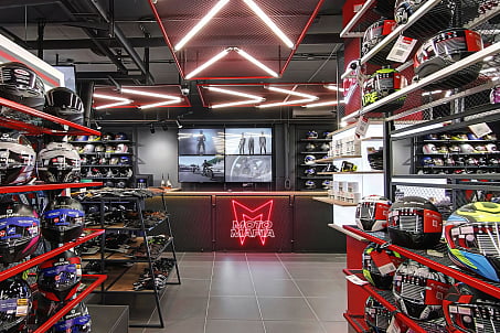
Fabula Branding developed a comprehensive visual system that is actively used both in digital and offline environments.
Result
Today, Motomafia is a recognizable brand with a strong visual identity, a powerful design code, and active market presence.
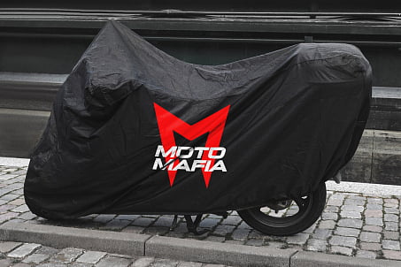
The brand has participated in motorcycle festivals, launched a merch line, created outdoor advertising, painted graffiti in its own space, and continues to build communication with its audience on social media. Today Motomafia unites those for whom freedom is not just a word, but a way of life.
Dmitry Kashkan, Managing Partner at Fabula Branding
"Working with Motomafia was a case where the brand was literally charged with the energy of its audience. The task wasn’t to simply ‘make something beautiful’ — we had to capture the philosophy and character of motorcyclists, then translate it into a visual language. The important thing is that we managed to not only create an identity but to build a complete communication system — from the logo to visual behavior scenarios across all touchpoints. This image doesn’t just stand out — it drives engagement and loyalty within the community."
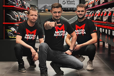
Ivan Simakin, Director of Motomafia
"When you get on a motorcycle, you’re not choosing transport, you’re choosing a lifestyle. Fabula Branding created an identity that conveys that feeling. This is not just about business or aesthetics — it’s about freedom, drive, and the true power of community. Today, when I look at the logo, I can say: it’s perfect, and I love it more and more."
