Napramak
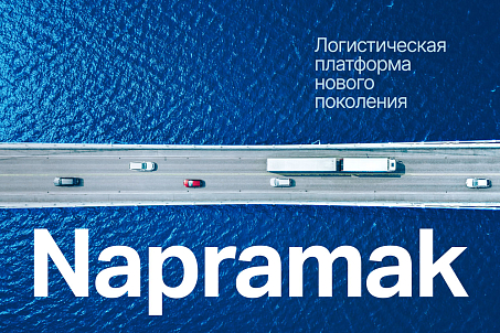
The product was built around a clear idea: making freight transportation more transparent and easier to track. This approach needed to be reflected in a brand identity that would feel technological, dynamic, and intuitive.
Fabula Branding was tasked with developing the brand name and visual identity, as well as demonstrating how the new visual language could work not only in brand communications but also within the digital product itself.
- Create a brand name;
- Develop Napramak’s visual identity;
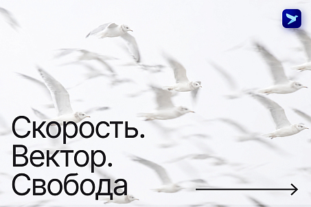
- Communicate the ideas of freedom, speed, and direction through design;
- Demonstrate how the visual identity could be extended to the app interface.
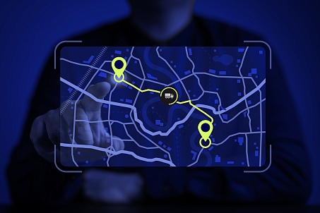
It directly reflects the essence of the product: the service allows users to monitor cargo movements along a route, track its journey, and follow its progress through key checkpoints. At the same time, the name goes beyond a literal description of the service. Its meaning encompasses not only movement from one point to another but also forward momentum, a clear sense of direction, and control over the process — concepts that are particularly relevant to a technology-driven logistics platform.
The Belarusian origin gives the brand a distinct local identity, while the Latin-script spelling, Napramak, makes the name concise and well-suited to the digital environment.
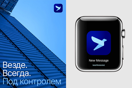
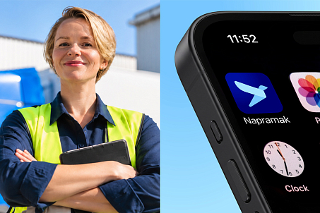
The concept is built around three key ideas: freedom, speed, and direction. Fabula Branding translated these principles into the logo, combining clean sans-serif typography with an origami-inspired bird symbol.
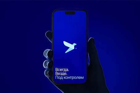
Its directional silhouette reinforces associations with routes, navigation, and movement toward a destination.
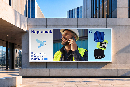
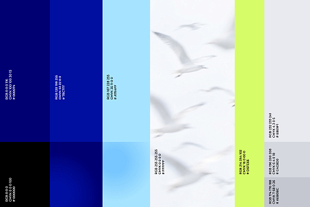
An accent green brings energy to the identity and helps highlight important elements.

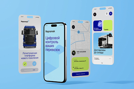
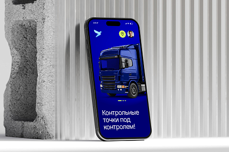
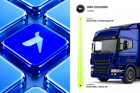
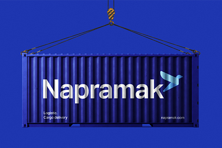
Through interface concepts, the team demonstrated how the visual identity could extend into the digital product, maintaining a consistent brand character across user touchpoints.

Using the developed brand assets, the client launched the Napramak website. The next stage of the brand’s evolution is the mobile application, which is currently under development.