Oronero

Brief
The agency was approached by a company supplying doors made of natural materials that meet international quality standards. They had to develop a brand for a premium product line from Italy.
The agency was to reflect in the solution the price segment and to clearly present the company to the partners and consumers.

Decision
The company was created by two brothers who know a lot about interior design and construction. Developing the rhythmic name Oronero, Fabula Branding retained the idea of duality.
The name is based on a combination of Italian words meaning "black" and "gold," which gives the brand elegance and an idea to develop an identity.

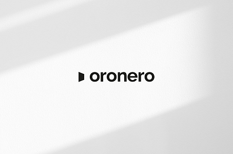
The laconic logo is grotesque fonts and a graphic interpretation of an open door.
The corporate identity is built on a minimalistic combination of black and gray hues with cool gold. This brand image helped the company to assert itself in a new way on the market, facilitated identification and conveyed the quality of the products.


