Positano Farmacia
Context
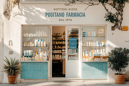
Positano Farmacia is a pharmacy network owned by the Rizzo family — a dynasty of pharmacists from the town of Positano, Italy. The first pharmacy opened its doors in 1975, and since then, the family has passed the business down through generations.
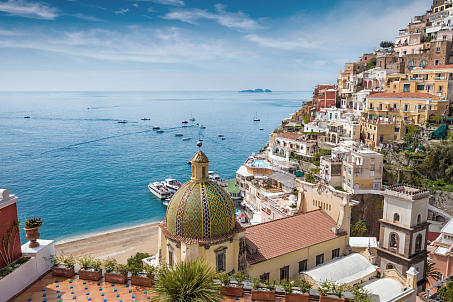
Today, the brand continues to grow, as does the popularity of Positano Essentiae products — natural cosmetics, sunscreens, vitamins, and perfumes crafted with love for Positano, the Mediterranean landscape, and local heritage.
Task
Fabula Branding was entrusted with developing the visual identity for two pharmacies in Positano owned by the founding family. The new identity needed to:
- highlight the long-standing history of the pharmacy and its connection to the region and pharmaceutical tradition;
- reflect the character and category of the products;
- evoke the aesthetics of Italian culture.

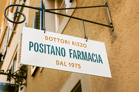
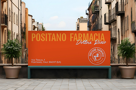
Minimal and refined, the logo seamlessly adapts across brand touchpoints, from pharmacy signage to product packaging.
Logo
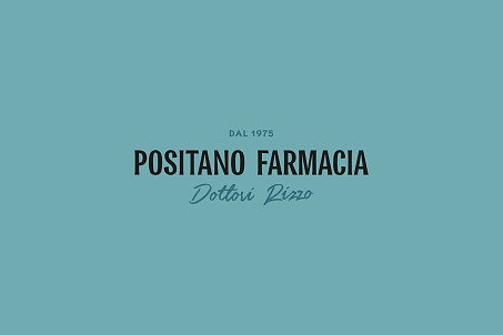
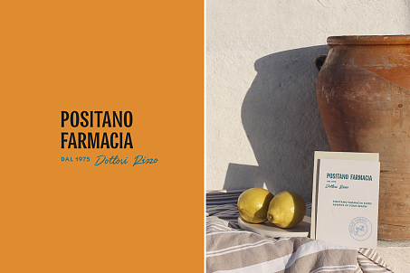
The logo for Positano Farmacia is a custom wordmark built on the balance of grotesque and serif letterforms — a combination that reflects both pharmaceutical precision and rich Italian expressiveness.
Visual Identity
The overall design concept is rooted in minimalism, reinforcing the brand’s premium perception. Clean lines, geometric balance, and visual clarity bring sophistication to every element of communication.
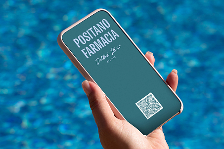
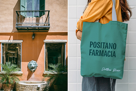
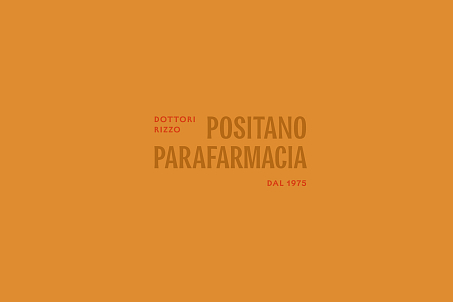
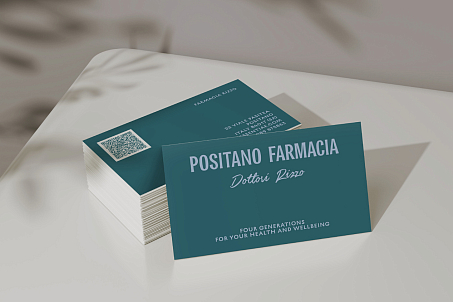
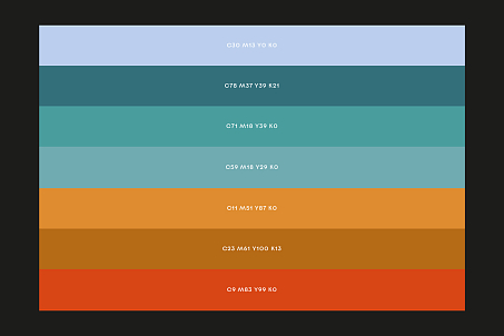
The brand’s color palette draws inspiration from the natural and architectural hues of Positano — the sea, streets, buildings, ancient frescoes, and coastal flora.
These tones form a distinct visual connection with the city and give the identity a unique, place-specific character.
The artwork depicts Hygieia, the goddess of health, seated on a sea horse — a symbol of the brand’s pharmaceutical roots and connection to Mediterranean nature.
Brand Mark
The centerpiece of the identity is the Positano Essentiae emblem, reminiscent of a quality seal and inspired by an ancient fresco discovered in a Positano villa.
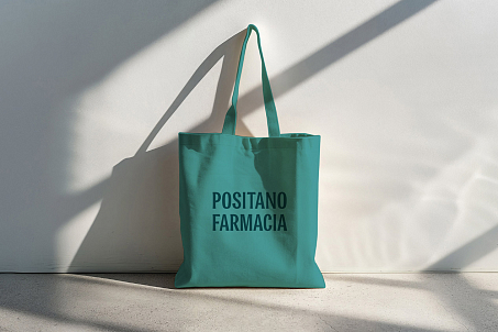
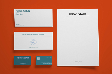
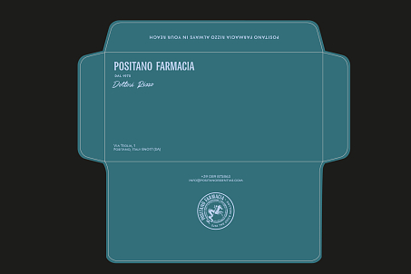
This emblem is featured on packaging, envelopes, and other materials as a symbol of authenticity and quality.

Result
Through close collaboration between the agency and the client, the Positano Farmacia brand received a visual identity that harmoniously integrates with the architecture of the city and its local atmosphere. It instills trust, reflects high product quality, and has become a key step in the brand’s evolution. The updated identity has strengthened Positano Farmacia’s position in the market and expanded its visual presence in the region.
