Prapanova

Brief
Fabula Branding was approached by an auto center offering a wide selection of pre-owned vehicles. Customers can not only buy a car here but also sell their own through trade-in, direct purchase, or credit toward a new vehicle.

A key advantage: all vehicles are owned by the auto center itself, ensuring full transparency in every deal.
The team also provides on-site financial services — with lending and leasing partners operating directly at the center, customers can get approvals quickly, even with no down payment.

Fabula Branding’s task was to create a name and visual identity that would reflect the auto center’s core values: honesty, convenience, professionalism, and care for the customer.

The name Prapanova is a pleasant-sounding Belarusian word that transliterates smoothly and captures the brand’s essence.
Name
It reflects the company’s respectful attitude toward its customers, evokes a sense of trustful dialogue, and symbolizes a new chapter in life.
To reinforce the concept, we developed a rhyming slogan: "Аўто нанова" ("A car, anew"), conveying the excitement of starting fresh and moving forward.


Additional messaging was also created to express the brand’s values. These phrases help build an emotional connection with customers and highlight the brand’s focus on comfort and trust.

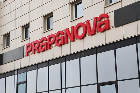
The Prapanova logo captures both the brand’s energy and philosophy. Its key element is the letter "A", whose top is stylized as a steering wheel — also referencing a roundabout or highway.
Identity
This design choice symbolizes freedom of movement, control on the road and in life, reliability, and protection — all guarantees the auto center proudly offers.

The color palette combines black, red, gray, and white — shades traditionally associated with the automotive world, while also emphasizing the brand’s relevance and tech-savvy spirit.

The mix of uppercase and lowercase in the logo adds uniqueness and makes it visually memorable. This design detail reinforces the feeling of strength, confidence, and leadership — qualities strongly associated with Prapanova.

The Prapanova brand emerged with a bold and well-structured identity that sets it apart from competitors and builds customer trust:
Result
- A unique, resonant name
- A strong visual identity reflecting the brand’s values and business focus
- Emotional resonance through slogans and a philosophy rooted in respect
- A modern, dynamic image that conveys leadership and professionalism
Prapanova has become the place where dreams of owning a car come true.


