EmandHof

Brief
Fabula Branding developed a logo and package design for EmandHof, a new trademark of premium aged hard cheeses produced by Syr Starodubsky, one of the biggest Russian cheese manufacturers and market leaders.

The customer wanted the new logo to focus on the traditional nature and premium quality of the product.
Decision
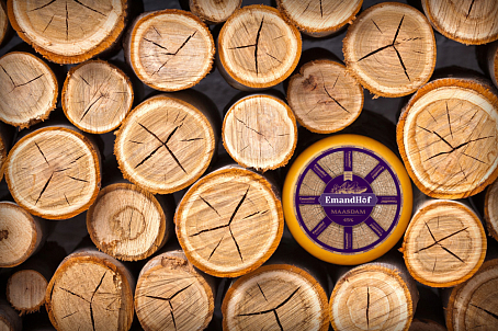
The name of the company and the place of its location (the town of Starodub (literally, Old Oak Tree) in Bryansk Region) suggested oak as a key visual image and a symbol of reliability, consistency, longevity, and tradition. The logo features a typographic block on a shaped panel. The design incorporates a graphic play that transforms the letter "o" into an acorn.

The packaging design concept continues the "oak" theme: featuring an image of a cross-section as the background and an oak leaf in the logo area, with a characteristic "wooden" color palette.

Radial lines radiating from the center facilitate cutting the cheese into equal portions and echo the brand name.
Additionally, they give the overall visual image a resemblance to a wooden wheel (a nod to rural life and its values of craftsmanship and tradition). The annual rings and cracks in the background image of the wood symbolize the maturity and aging of the classic hard cheese from TM EmandHof.

The project ranked 8th in the 2017 brand rankings compiled by Forbes magazine in conjunction with branding experts. The concepts and identities of 30 brands across 16 product categories were evaluated, with scores compiled to produce an average score, determining the finalists.


