Grand
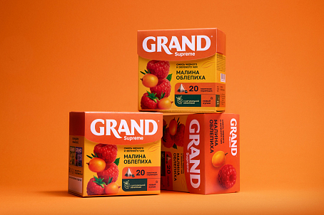
The client approached Fabula Branding with the task of refreshing the packaging design for the Grand Supreme pyramid tea bag range.
Brief
The tea category is highly competitive, with dozens of vibrant packages sitting side by side, each fighting for the customer’s attention. In such an environment, packaging must do more than communicate the product’s flavour and format: it needs to be instantly recognisable, visually distinctive and appealing enough to make customers want to pick it up.
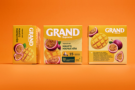
Fabula Branding’s goal was to retain the recognisability of Grand Supreme while making the range more modern, noticeable and attractive.
Objectives
- make the brand stand out on a highly competitive tea shelf;
- enhance the logo and increase the visibility of the brand block;
- improve the legibility and composition of the range name;
- create a more appetising appearance through the use of colour, berries and fruit.
Logo Redesign
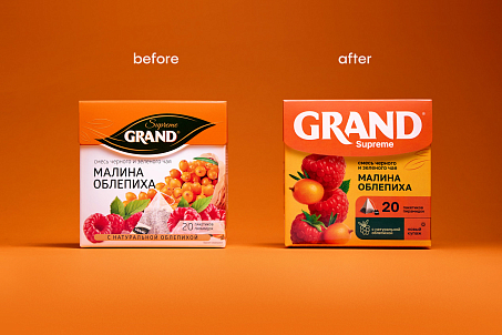
In the previous design, the logo was placed inside a graphic interpretation of a tea leaf, visually separating the brand area from the rest of the packaging composition. This made the trademark more difficult to recognise at a glance.
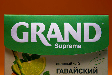
Fabula Branding enlarged the wordmark, removed unnecessary decorative elements and moved it to the top panel of the packaging.
Thanks to its new placement, increased scale and minimalist presentation, the logo became more visible and began to serve as a strong brand accent.
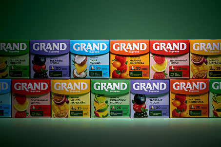
The Supreme range name was also made more prominent and repositioned lower in the composition. The layout was carefully restructured so that every element of the packaging worked together harmoniously. As a result, the brand, range name, flavour and product imagery became part of a unified visual system.
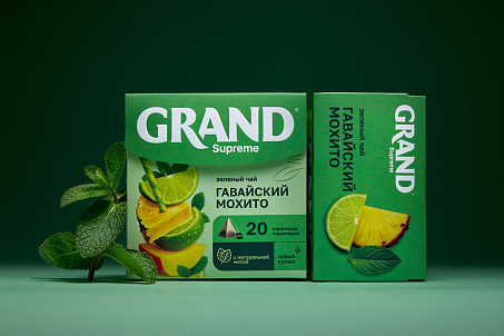
Packaging Redesign
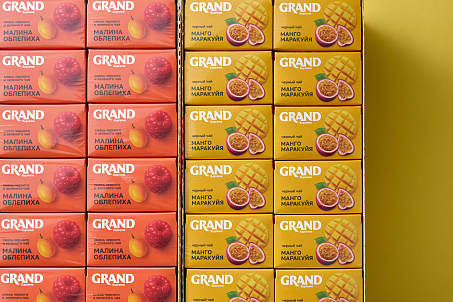
In the new design, Fabula Branding focused on brightness, richness and flavour appeal. This is particularly important in the tea category, where purchasing decisions are often driven not only by rational considerations but also by emotional responses to colour, appetising details and an overall sense of freshness.
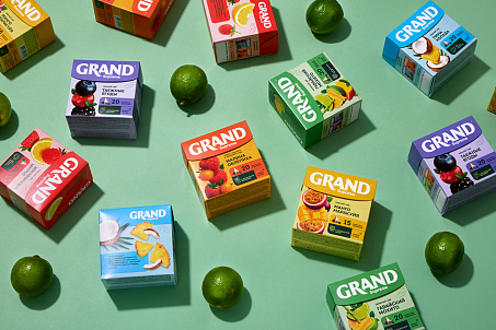
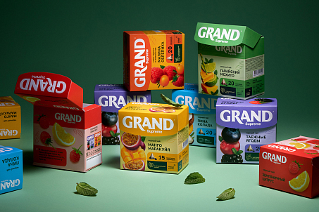
The agency retained the continuity of the range’s core colours while updating the shades and introducing an additional background colour for each flavour.
This made the packaging appear brighter and more dimensional while preserving its connection with the brand’s previous visual identity.
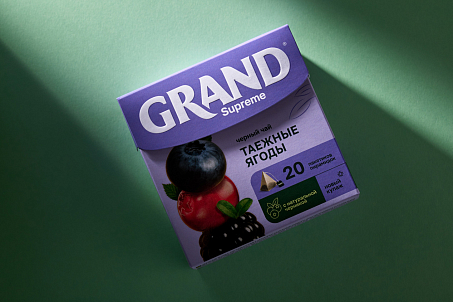
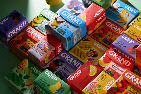
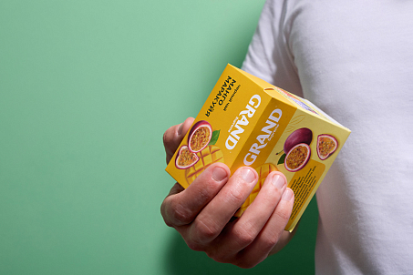
Fabula Branding moved away from the previous neutral presentation of ingredients and placed large, vivid photographs of juicy berries and fruit at the centre of the composition.
The product imagery area was completely reimagined. The agency also improved packaging navigation by organising key information into concise infographics. This made the content easier to understand while preserving the clarity and visual impact of the design.
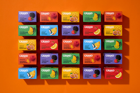
The new packaging communicates each flavour more quickly, strengthens the product’s emotional appeal and makes the range more visible among competitors.
Result
The Grand Supreme redesign refreshed the overall image of the range, making it more noticeable, contemporary and attractive. Fabula Branding preserved the brand’s visual continuity while giving the packaging a brighter, more confident and competitive presence on the shelf.
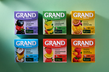
To date, more than 12 products featuring the new design have already been launched in Russia. The range has received positive feedback from consumers and continues to expand. The client has also reported growing interest in the product from retail chains.