Heart&Soil
Brief
The client approached Fabula Branding with a patented innovative product — natural fertilizers that are eco-friendly, safe for both soil and people, and effective for a wide range of crops: from flowers and berries to vegetables, mushrooms, and ornamental plants. The brand’s primary markets are Germany, the Czech Republic, and other countries with high environmental standards and a strong focus on sustainable production.
The company’s philosophy is rooted in respect for nature and the desire to restore balance between humans and the earth.
For over 30 years, the team has researched organic substances, developed safe extraction methods, and tested formulations to create fertilizers that not only nourish plants but also bring life back to the soil.
Objectives
- Conduct research and analysis of the European market, target audience, competitive environment, and visual codes of the category;
- Develop positioning that reflects the philosophy of gentle care for the earth;
- Create a name that is understandable and emotionally resonant for the European market;
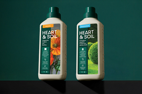
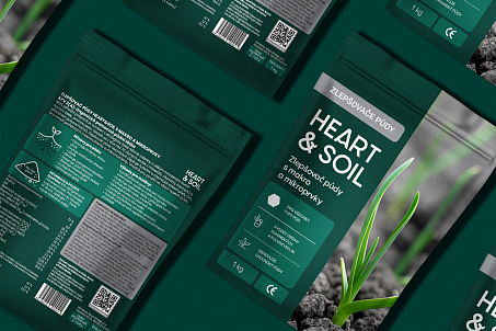
- Develop brand identity and packaging design adaptable for a broad product range and different markets;
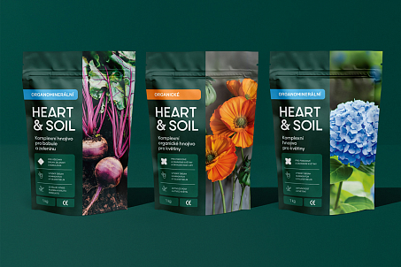
- Design a navigation system within the product line while maintaining brand integrity and recognizability;
- Create a UX/UI design for the website that presents Heart&Soil as an expert, modern, and eco-conscious brand with a mission.
Research and Analytics
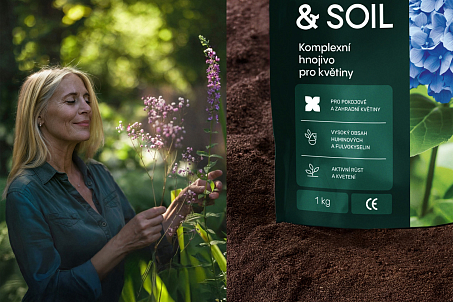
Before development began, Fabula Branding conducted an in-depth analysis of the European organic fertilizer market, exploring demand structure, pricing, visual codes, and key agricultural trends. Special attention was paid to the target audience — farmers and private gardeners who practice conscious consumption and value eco-friendly technologies.
The research revealed that although many “green” brands exist, most focus solely on functionality or technology.
Heart&Soil needed to combine expertise with emotional depth — to become a brand that tells a story of mutual care between people and the earth.
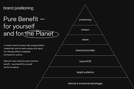
The positioning concept Pure benefit — for yourself and for the planet embodies a powerful idea: by caring for the earth, we care for ourselves.
Positioning
It’s a philosophy of responsibility, gratitude, and giving back to nature what it generously gives us.
This positioning reflects two key facets of the brand. The rational — effectiveness, safety, usefulness, and environmental integrity of the fertilizers. And the emotional — connection with nature, respect for its rhythms, and a desire for harmony and purity. Thus, the agency began building a modern brand of natural, bioactive fertilizers produced using safe technology, adaptable to the needs of both farmers and private growers.
Naming
The name Heart&Soil plays on the familiar English expression Heart and Soul. It reflects the very essence of the brand: heart and soil — two sources of life, two forces essential to existence.
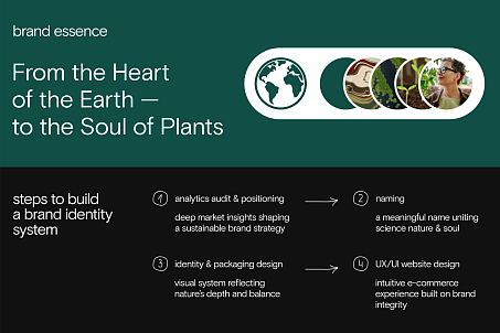
Heart symbolizes humanity, care, energy, and sincerity. Soil represents fertility and the earth itself — the source of all things.
The name creates a harmonious space where people and nature act together rather than oppose each other. The name is concise, pleasant to the ear, easy to remember, and works equally well in English, German, and Czech. It evokes associations with warmth, vitality, and purity.
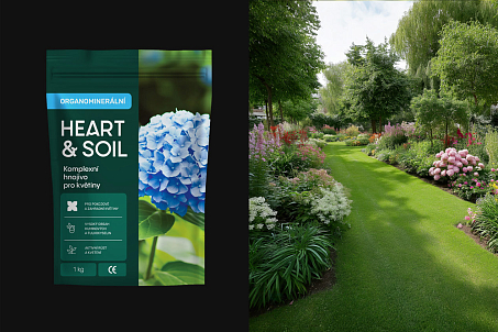
Fabula Branding developed a visual language that conveys the brand’s depth, naturalness, and scientific foundation.
Packaging Design
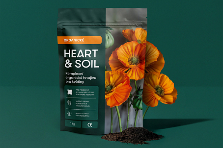
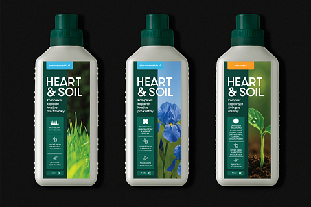
The core idea was to show the product’s origin from the earth’s depths — to emphasize its natural power and ecological purity while maintaining modernity and versatility.
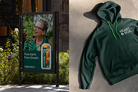
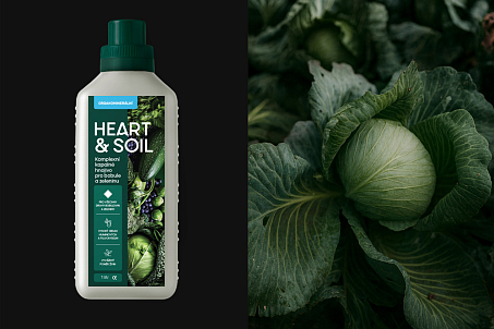
To accommodate a large product range, the packaging follows a modular principle: visual division into two parts makes the design clear and flexible. The left half — an informational zone in the brand’s signature green — contains product data, category, and characteristics. The right half — the emotional zone — features photography showcasing the plants the fertilizer is designed for. To enhance navigation within the line, Fabula Branding created a system of geometric markers — simple shapes that help users quickly identify each product.
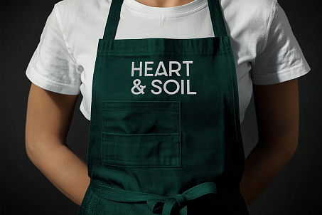
The logo is based on a soft grotesque typeface with smooth lines, creating a sense of naturalness and confidence.
Logo
Special attention was given to the ampersand (&) symbol — stylized as a living form resembling a sprout. This element visualizes the essence of the name: where people care for the earth, life begins.
Color Palette and Style
A deep green serves as the primary color — symbolizing nature, sustainability, and life energy. Supporting shades are natural and reinforce feelings of eco-friendliness and trust.
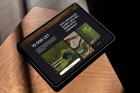
The identity combines scientific precision with emotional warmth: clean typography, ample white space, and a balance between structure and organic textures.
The brand’s visual language looks equally natural both on supermarket shelves and in digital environments.
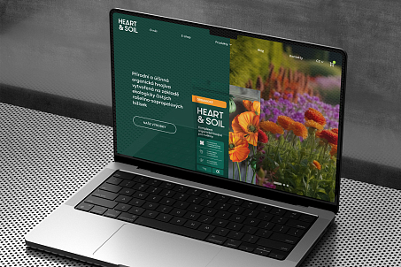
Fabula Branding developed the UX/UI design for the e-commerce website, where users can explore the brand, its philosophy, and purchase products.
UX/UI Website Design
The website merges emotion, aesthetics, and functionality while visually supporting the overall identity: clean space, deep natural hues conveying eco-consciousness and scientific precision.
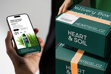
The website tells the story of the product’s origin, mission, and real benefits, fostering a culture of conscious farming.
The main goal was to reflect the brand’s philosophy and make product discovery and purchasing intuitive and seamless. Navigation is logical and user-friendly, allowing visitors to move easily from product information to specific solutions for different crop types. Each product is presented as part of a unified ecosystem, and through imagery of soil, plants, and natural textures, users feel the living connection between people and the earth.
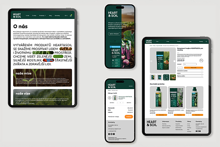
Heart&Soil became a vivid example of a new generation of agricultural brands — those that speak the language of awareness, respect, and love for the land.
Result
Thanks to its strategic positioning, recognizable identity, and international potential, Heart&Soil confidently enters the European market — where ecological integrity, purity, and real benefit are valued, both for people and for the planet.
