Landers

Brief
What does one need for a brand of cheese? Fresh milk from cows from their own farm, an original recipe, skilful and talented master cheesemakers and a bright, spectacular brand developed by experts. That's how Landers cheese was born.


The basis for the name was the root of the word “land”, meaning earth or country, with characteristic Northern European steadiness and clarity of sound.
Decision
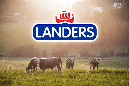
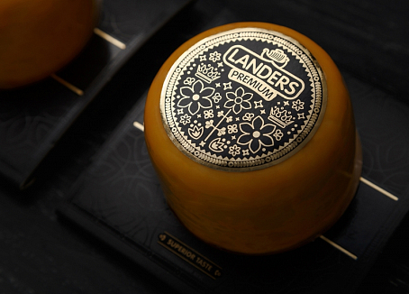
Since the closest "relative" of the Landers cheese is the famous Danish Havarti, the trademark was stylized in the spirit of traditional northern European motives, ornaments and folk costumes, which in turn made the design look more modern and refreshing. Bright and juicy colors maximized the product on the shelf and at the same time are clearly connected with the dairy product group.

The soft cut-out font and the rounded-corner panel highlight the friendly character of the brand, while the stylized image of the drakkar reinforces the idea of Northern European design. The contrasting white outline allows the brand logo to be emphasized and brought to the forefront.

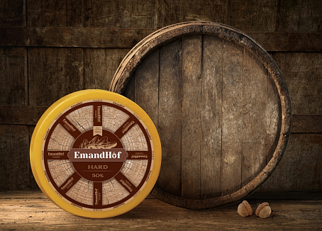
When developing the brand design for each type of cheese, a single style of the concept got its own color scheme and an illustration.
This solution enabled easy recognition of the products while preserving the brand's recognition and individuality to the fullest.


