Prank

The client was preparing to launch a sugar-free beverage line with unconventional flavors like popcorn and bubble gum.
Brief
The product was specifically aimed at kids and teenagers—an audience eager to try something new and exciting. Fabula Branding was tasked with developing a brand name and packaging design that would instantly grab attention and make the product stand out.


Decision
The naming process began with an immersion into the slang and language of the target audience. The goal was to create a bold, energetic, and fun name that kids and teens would instantly recognize as “their own”.


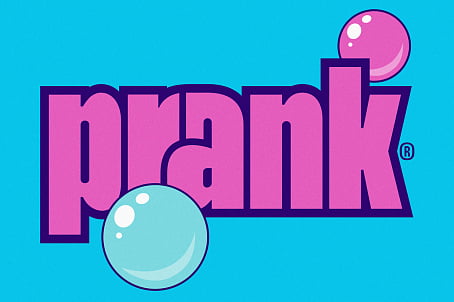
This led to Prank—a word that is widely used in the world of video bloggers, referring to playful mischief and surprises.


The visual identity was inspired by the charismatic name and the vibrant colors of the beverages themselves. The bold blue and peach tones were so dynamic that they became integral to the packaging design. Fabula Branding created contrast-rich color combinations for label elements and placed a graffiti-style logo as the packaging’s focal point, reinforcing the brand’s edgy and youthful vibe. Additionally, playful brand characters were designed to represent the different flavors, making them more relatable and visually connected to the Prank concept.
With its eye-catching visuals and rebellious personality, Prank is a brand that speaks directly to its audience—inviting them to have fun, explore new flavors, and embrace the unexpected.


