Rokodil
Brief
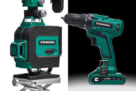
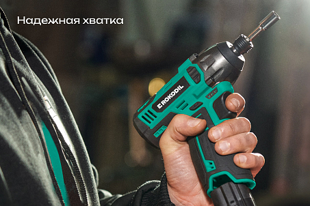
Rokodil is a brand of repair, construction, mechanical, and automotive tools. Its philosophy is simple and transparent: ergonomics + reliability + style + functionality = a product you can trust.
Market is evolving, the competitive landscape is growing, and the customer expects a new level of communication and engagement. All this sparked the need for a major upgrade.
The brand already had a striking name and identity. Fabula Branding's task wasn’t just to “refresh” the visuals — it was to amplify the brand’s character and make its communication bold, contemporary, and cohesive. At the same time, it was important to preserve recognizability and the signature style, while retuning the brand to meet the ambitions and expectations of a new audience.
Research & Analytics
The agency conducted an analysis of the market, audience, and competitors. Based on this, it developed a set of strategic recommendations focused on:
- strengthening the emotional connection with the consumer;
- showcasing the product’s character and capabilities;
- ensuring clarity and ease of perception across all touchpoints.
Positioning
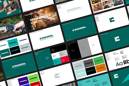
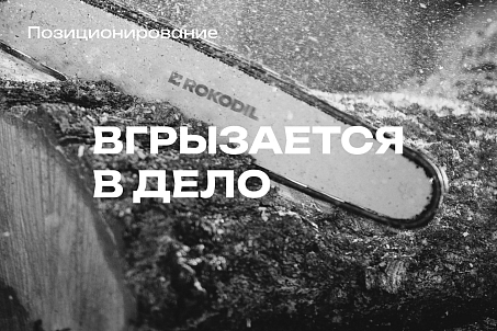
The agency developed the positioning “Sinks Its Teeth Into the Job” — loud, unexpected, and absolutely in line with Rokodil’s spirit. The phrase was so striking that it ultimately became the brand’s slogan, conveying strength, persistence, confidence, and energy.
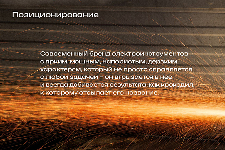
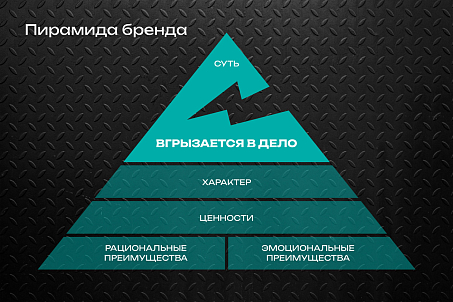
The brand "sinks its teeth" into any task like a true predator. It’s unafraid of challenges, works with precision, force, and efficiency. These are tools you can rely on — always.
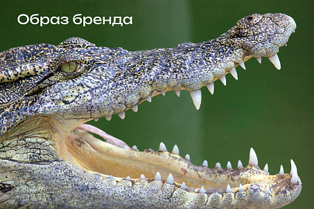
This image opened up incredible space for communication. Thus, the crocodile evolved from a visual symbol into the semantic core of the brand’s entire language, communication, and tone of voice.
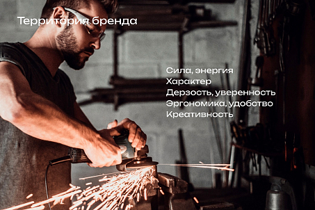
Logo Redesign
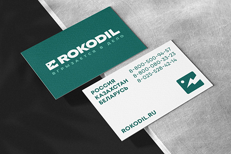
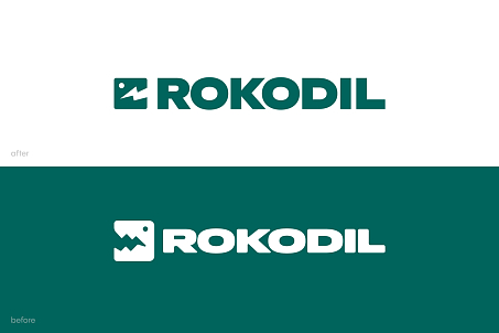
One of the key steps in working with the brand was updating the logo. The agency refined and simplified the form of the brand symbol — the crocodile — making it more dynamic. An accent in the form of a lightning bolt was added, symbolizing bite force, energy, and speed. The symbol was synchronized with the type block, proportions were aligned, and visual integrity was enhanced. A font search followed, resulting in a harmonious choice.
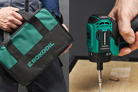
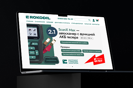
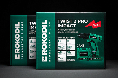
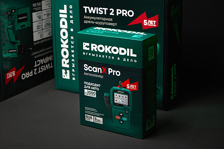
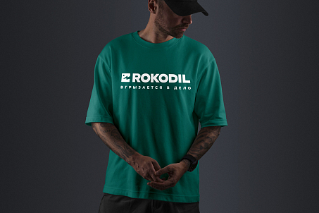
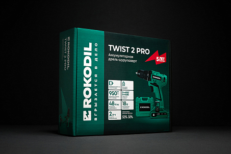
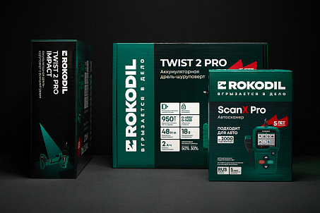
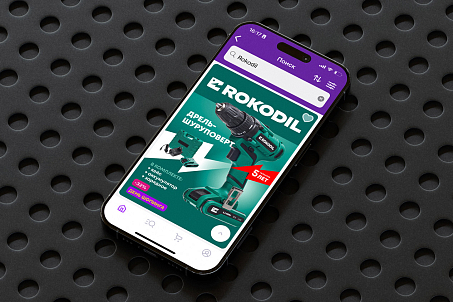
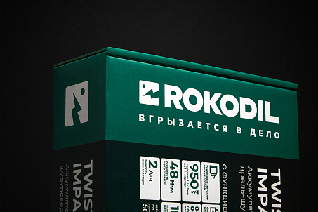
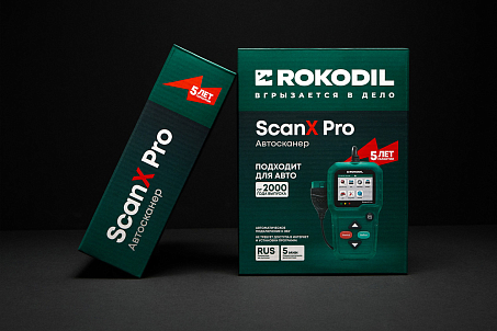
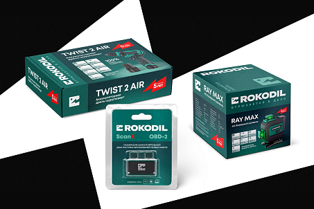
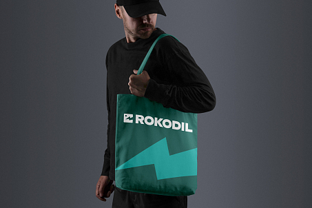
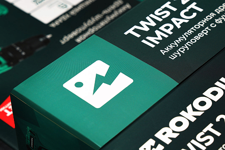
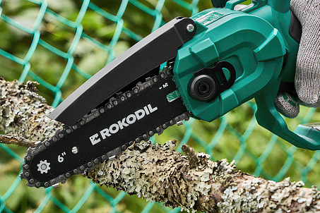
The “toothy” lightning bolt is also used as a standalone element of the identity — in website design, packaging, merchandise, and other touchpoints.
The result is a modern, minimalist, powerful logo that works equally well in digital and physical formats.
The Result
The redesign became a powerful tool that made the brand more recognizable, sharper, and more competitive. And the new positioning brought the communication to life — bold and compelling.

Rokodil is already sinking its teeth into the market: expanding its presence, attracting attention, staying memorable. And doing it effectively.

