BNBC

Brief
The Belarusian National Biotechnology Corporation is the largest biotechnology complex in the CIS producing essential feed amino acids, compound feeds and premixes, wheat gluten, and other products of deep grain processing.

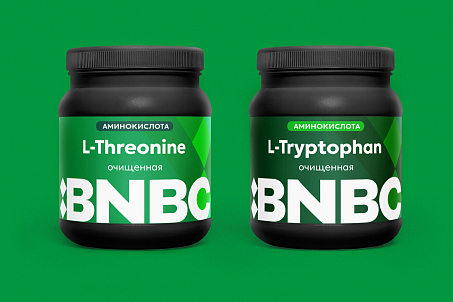
BNBC became the first and only company in Belarus to produce four essential amino acids through microbial synthesis: L-lysine sulphate, L-lysine monohydrochloride, L-threonine, and L-tryptophan.
Fabula Branding was tasked with carrying out a comprehensive rebranding of BNBC and creating an integrated brand system that reflected the company’s true scale.
Behind these complex technological processes stands a world-class enterprise with large-scale production, state-of-the-art facilities, scientific expertise, and a complete raw-material processing cycle. However, the company’s existing visual and verbal identity did not fully communicate its unique strengths, structure its offering, or consistently convey its advantages to different audiences.

Objectives
- audit the brand, market, competitive environment, and existing communications;
- identify the company’s strengths and develop a strategic foundation for the brand;
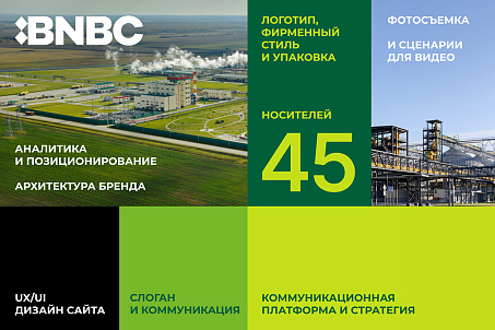
- create positioning that reflected BNBC’s scale, technological expertise, and systematic approach;
- revise the brand architecture and structure the product portfolio;
- update the logo and develop a scalable visual identity;
- create a slogan, communication platform, and Tone of Voice;
- develop an annual communication strategy;
- design key brand applications;
- develop a photography concept and scripts for corporate image films;
- design a new corporate website with a user-friendly product catalogue.
Research, Analysis, and Audit
The Fabula Branding team began the project with a comprehensive analysis of the market, competitors, industry trends, customer expectations, and BNBC’s existing communications.
The research revealed that the company’s former image did not reflect its true scale. The product portfolio lacked a clear structure, the advantages of its production capabilities were communicated in a fragmented way, and its unique technological expertise was not presented clearly to employees, clients, partners, or the market as a whole.
BNBC was already a major industrial complex with high production capacity, modern equipment, and technological capabilities competitive on a global scale.
However, systematic reputation management and promotion required a unified strategy that would bring together the company’s products, meanings, visual solutions, and communication tools.

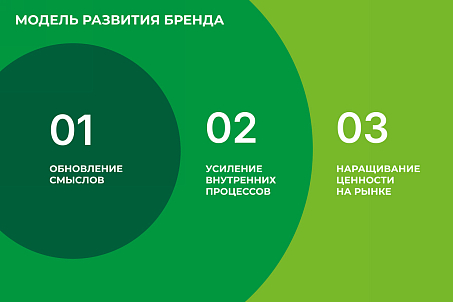
Following the analytical stage, the agency revised the brand architecture and created a foundation for the further development of the entire brand system.
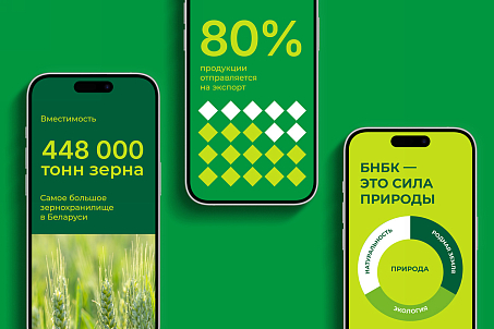
The new positioning developed for BNBC by Fabula Branding is “Bioarchitects of Growth and Development.”
Positioning
It reflects the professional character of the brand, bringing together scientific precision, technological expertise, and the scale of the corporation’s operations within a single concept. Like architects, BNBC specialists design a resilient system in which every element performs a specific function and contributes to the overall result. This creates the image of a balanced ecosystem of growth and development, where everything is interconnected, carefully planned, and focused on long-term results.

Visual Identity
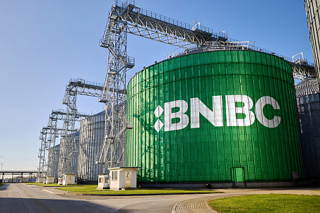
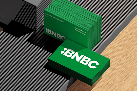
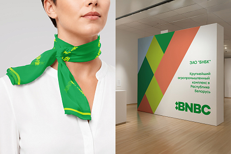
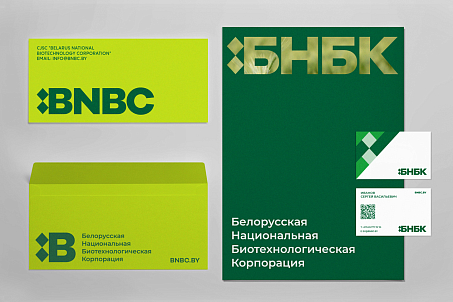
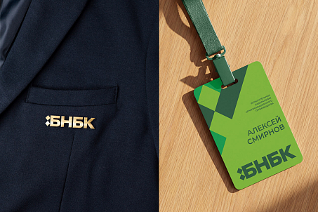
The updated logo was developed in both Cyrillic and Latin versions. It combines a bold wordmark with a concise graphic symbol composed of two diamonds. In the Latin version, the symbol is integrated into the letter B, becoming a natural part of the name.
The symbol brings together BNBC’s key characteristics: national identity, scientific expertise, technological advancement, and its connection to grain processing.
The minimalist geometry of the graphic element carries several meanings at once. The two diamonds resemble the structure of a chemical compound, referring to the company’s scientific and biotechnological activities. At the same time, the shape is characteristic of traditional Belarusian ornaments and resembles a grain or elements of an ear of wheat.

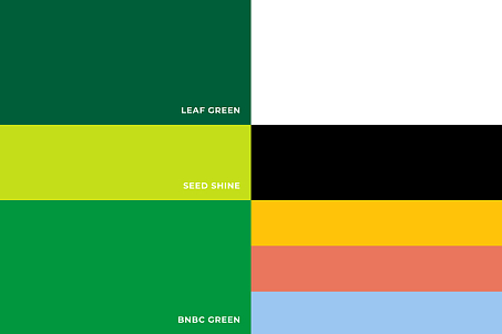
The brand colour palette draws inspiration from the landscapes of Belarusian grain fields. Green evokes a growing field, yellow symbolises grain and a ripe harvest, while blue recalls the open sky.

The identity communicates reliability, confidence, and the company’s business-oriented character without making its communications feel cold or impersonal.
Thanks to the minimalist visual system, the graphics can be easily scaled and adapted across formats—from product packaging and corporate documents to industrial vehicles and large-scale environments.

A comprehensive system of branded applications was created for BNBC, covering the company’s primary areas of operation and communication.
Brand Applications
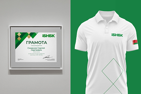
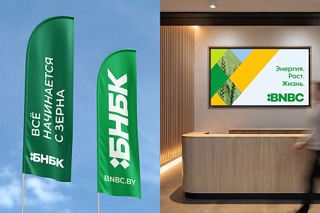
It included product packaging, corporate documentation and stationery, flags and environmental graphics, corporate merchandise, advertising and informational materials, and the branding of various types of transport. Every application became part of a unified visual system, allowing the brand to appear consistently and recognisably across all touchpoints.

At the client’s request, the Fabula Branding team also designed a corporate gift book. Its visual design was based on the principles established in the brand guidelines and continued the brand’s overall stylistic direction.
BNBC’s new slogan, “Everything Starts with a Grain,” reflects the foundation of the company’s production processes while revealing the broader meaning behind its work.
Slogan and Verbal Communication
A grain becomes the starting point of a complex technological chain. Through scientific research, advanced production, and deep processing, it is transformed into products that support agricultural development, increase production efficiency, and create a foundation for further growth.
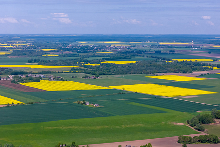
The slogan speaks not only about raw materials, but also about the potential contained within something small. Large systems, new opportunities, and sustainable development all begin with one precise starting point—with a grain. The agency also developed a set of verbal messages for different channels and formats, enabling BNBC to communicate the scientific, industrial, national, and human dimensions of the brand consistently.

For international communication, an English adaptation of the slogan was created: “From a Seed, Everything Grows.”
It preserves the original metaphor and emphasises the brand’s universal idea: a seed contains potential from which, through the combined power of nature, science, and technology, significant growth can begin.
The Fabula Branding team studied trends in industry communications and analysed how competitors interacted with clients, partners, employees, and public authorities.
Communication Platform and Strategy
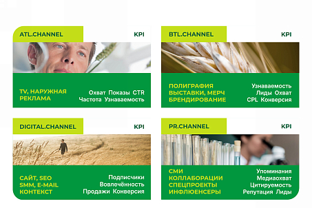
Based on this research, the agency defined the brand’s primary and supporting messages, established a clear framework for their use, and developed BNBC’s Tone of Voice. The team also audited the company’s existing channels, prepared recommendations for visual content creation, and proposed ideas for digital, ATL, and BTL communications. A detailed annual strategy was created for the client, outlining the sequence of implementation stages, key objectives, content formats, and future directions for communication development.
Photography
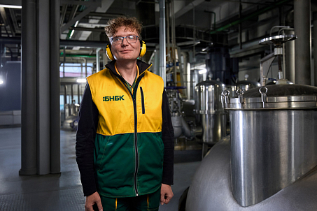
The renewed brand required its own visual content capable of conveying the scale of production, the technological complexity of its processes, and the people behind the corporation’s work. Fabula Branding developed the photography concept and organised its implementation together with the client’s team and external production partners. The project covered several areas, including on-site photography at the production facilities, corporate image photography, and aerial drone footage of the complex.
The resulting materials presented BNBC simultaneously as a major international industrial enterprise, a modern technological complex, and a team of professionals united by a shared purpose.

To develop BNBC’s image communications, Fabula Branding created scripts for two key corporate videos: a corporate image film and a brand manifesto film.
Video Concepts and Scripts
The corporate image film was designed to demonstrate the scale of BNBC’s production, the complexity of its technological processes, its advanced equipment, and the corporation’s importance to the development of the industry. The manifesto film was built around the brand’s central idea and its positioning, “Bioarchitects of Growth and Development.” Its purpose was to reveal the company’s role on an emotional level: transforming the potential of natural raw materials into advanced technological products and creating a foundation for sustainable growth.

The agency developed the narrative structure, key messages, visual language, and overall communication logic, providing a complete conceptual foundation for the subsequent production of the films.
The new BNBC website was designed around the brand’s Big Idea, updated architecture, and the needs of its different target audiences.
Website UX/UI Design
Structuring the product portfolio made it possible to create a clear and consistent catalogue in which users can quickly find the categories and products they need.
The website’s visual and verbal presentation emphasised the global scale of the project, the technological sophistication of its production facilities, its comprehensive approach to deep grain processing, the corporation’s national and economic importance, and its international potential.
Special attention was also given to the employer brand. The website presents not only the company’s products, but also professional opportunities, career development prospects, and the advantages of working for one of the country’s most technologically advanced companies.
As a result of the comprehensive rebranding, BNBC received an integrated brand system that reflects the company’s true scale and level of expertise.
Result
The strategy, brand architecture, positioning, visual identity, and communication tools were united by a single idea and began working together as one coherent mechanism

The renewed brand helped BNBC to:
- structure its extensive product portfolio;
- make the company’s advantages clearer to the market;
- emphasise the technological sophistication and international standard of its production;
- strengthen the brand’s national identity;
- establish a unified standard for visual and verbal communication;
- create a foundation for systematic promotion and employer-brand development.

BNBC emerged not simply as a major industrial enterprise, but as a team of bioarchitects who use science and technology to design a sustainable ecosystem of growth—starting with a grain.
“Communicating not only BNBC’s technological expertise, but also the company’s scale, national identity, and importance to the development of the industry was essential to us.”
BNBC Marketing Department
“The Fabula Branding team immersed itself deeply in the specifics of our production processes, gained a clear understanding of our complex product structure, and helped unite our different areas of operation within one coherent and accessible system. The new positioning, visual identity, and communication platform have created a foundation for consistent brand development across all channels. We can now communicate BNBC’s capabilities more clearly to the market, our partners, and future employees while maintaining a business-oriented, confident, and open tone.”
Dmitry Kashkan, Managing Partner at Fabula Branding
“Some projects are inspiring through their scale and meaning alone. BNBC is one of them. At the heart of its highly complex biotechnological production lies a grain—a simple natural element that contains immense energy for growth.”

“It was important for us to reveal this connection between nature, science, and technology. We wanted not only to demonstrate the power of the enterprise, but also to express the idea of transformation: how the potential of a grain, through knowledge, precision, and human expertise, becomes a range of products that matter to entire industries.”