Barista Pro
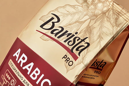
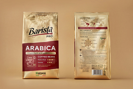
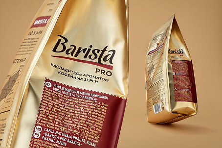
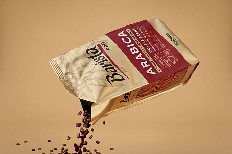
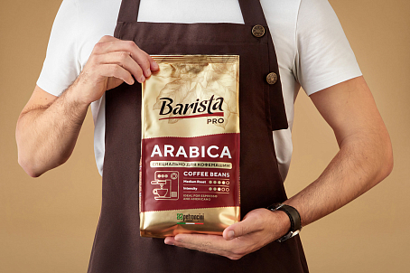
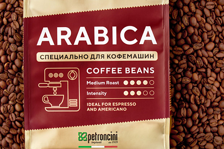
Fabula Branding redesigned Barista Pro's packaging, helped it stand out on the shelf, and compiled the product's important features and benefits into a handy infographic for the consumer.
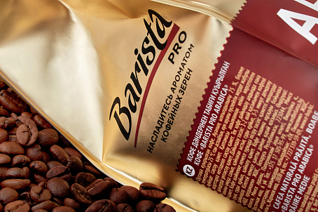
The agency team maintained continuity with a gold background, adding a botanical illustration of a coffee tree to translate the premium appeal. They also shaped the information block to make it easier to identify and select the product on the shelf.
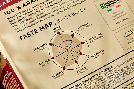
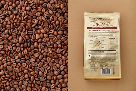
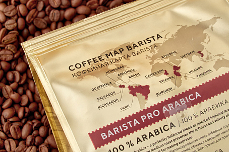
Particular attention was paid to the back of the packaging. The origin story of each variety, the coffee map and the flavour map help us to learn all about the coffee's richness, density, aftertaste and other qualities.
