Logo and Packaging Analysis
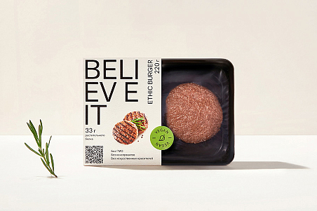
How does one analyze a product logo or package? According to consumer market studies, most purchases are made spontaneously, and an attractive package plays a key role in this process.
But what makes a package attractive?
Each type of target audience has its own criteria: some focus on creativeness and novelty, others like familiar and easy-to-understand design solutions.
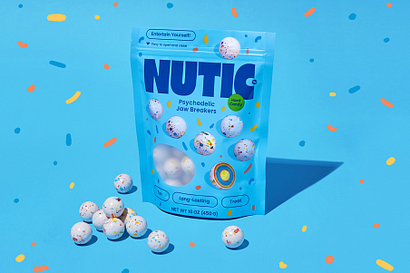
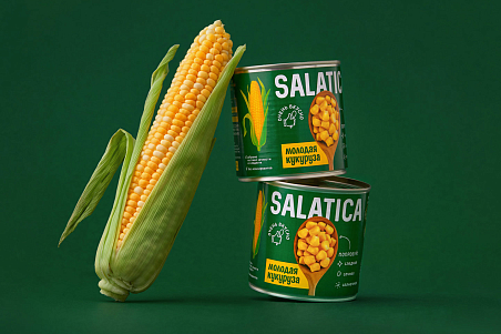
The price segment also plays a role in this process. Each segment has its own typical features: while the packages of economy products require bright colors, clear zoning, and large lettering, premium products are distinguished by their laconic package design and subtle color palette.
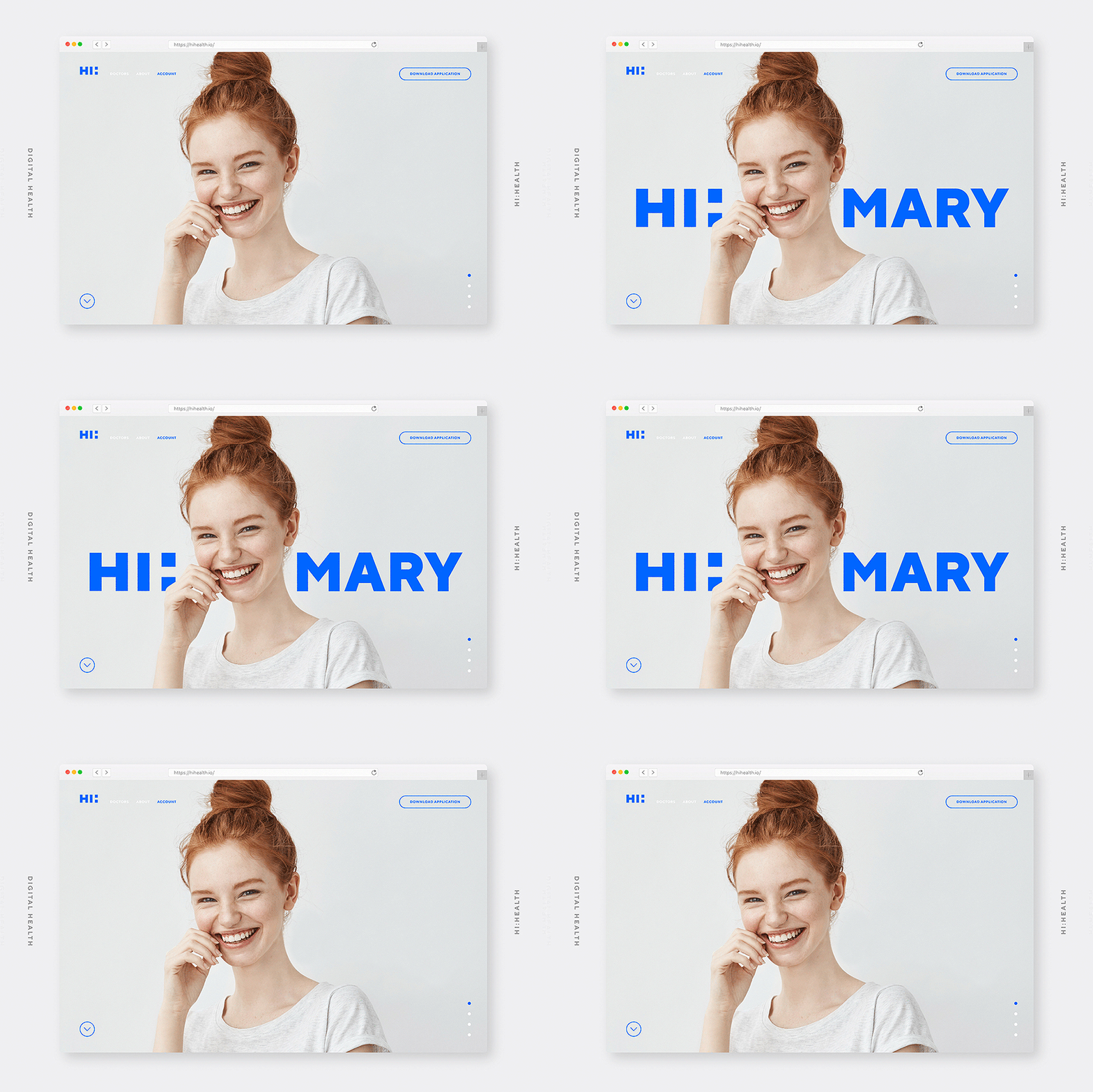
Logo Perception Analysis
Every person has certain associations with shapes and colors:
- Ellipses express friendliness, while squares and rectangles symbolize stability, strength, and professionalism.
- Laconic grotesque lettering refers to expert knowledge and productivity; handwriting—to the home atmosphere and local craft production; and pointed letters add dynamics.
- Horizontal lines communicate the idea of calmness and serenity, and vertical—of power and ambition.
- A pastel color palette refers to softness and elegance.
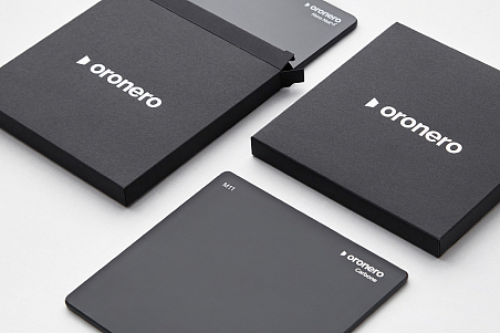
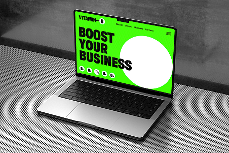
- Deep dark colors express the idea of premium quality, while bright tones make a product more recognizable and emotional.
Knowing all these factors, one can effectively analyze a corporate logo.
Package Design Analysis
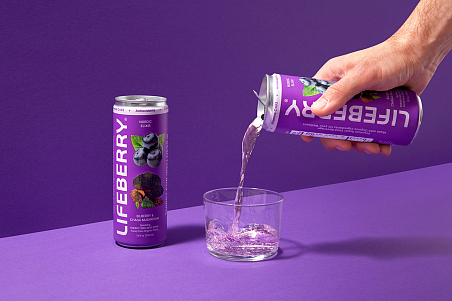
The competitiveness of a product is determined not only by its consumer qualities but also by its package. Package design communicates the positioning of a product and its USP.

